
Edit, reorder and remove layers
The list on the left of the Layer Manager is your map from top to bottom. Drag rows to change which layer draws over which, hide or remove a layer with the buttons on its row, and select a row to change its settings.
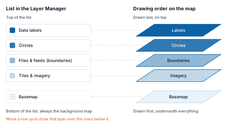
The quick path
- Reorder: drag a row by its grip, or use the Move up and Move down buttons on the row.
- Hide or show: select the eye button on the row.
- Remove: select the bin button, Remove from the map.
- Edit: select the row. Its editor opens in the right column.
- Save: select Apply changes. Until then nothing in the report changes.
The list and the drawing order
The list under On the map shows every layer that is switched on, data layers and reference layers together, with the top-most first. A layer higher in the list is drawn over the layers below it. The Basemap row is always last, because the basemap is drawn under everything.
The order comes from each layer's Z-Index setting, the same number you can see in the Format pane: a higher number is drawn on top. The list sorts the layers for you, so you do not need to work with the numbers.
What a row shows
From left to right:
| Part | What it is |
|---|---|
| Grip | Drag it to move the row. |
| Picture | A small picture of the layer type. |
| Name | The layer's name. A New badge marks layers added since the dialog opened. A warning icon marks a data layer that is on but draws nothing. |
| Detail line | Data layer or Reference layer, and where it comes from, for example "Reference layer · WFS" or "Data layer · Uploaded file". For a layer that draws nothing, the reason replaces this line. |
| Move up, Move down | Move the row one place. |
| Eye | Hide or Show the layer. A hidden row is dimmed. |
| Bin | Remove from the map. |
Not every row has an eye or a bin: see "Which rows can be hidden or removed" below.
Layer names are worked out for you: the uploaded file's name, a name taken from the link, the title of the ArcGIS or catalog layer, or the layer chosen from a WFS, WMS or WMTS service. Otherwise the row gets a numbered name such as "Files & feeds 2". A layer cannot be renamed or duplicated here.
Reorder layers
Use any of these:
- Drag a row by its grip and drop it on the row whose place it should take.
- Select Move up or Move down on the row.
- With the keyboard, move the focus to a row and press Alt+Up or Alt+Down.
Each move counts as one change in the footer. When you apply, the Layer Manager updates the Z-Index of the row you moved to fit between its new neighbors. If the neighbors' numbers leave no room, the rows below are renumbered as well. You will see the new numbers in the Format pane.
Circles and Images & icons are two rows, each with its own Z-Index, so moving one does not move the other. Labels on circles and images belong to the Data labels row, which stays above both.
Default order
A layer you have not moved sits where its default Z-Index puts it. From the top:
| Layer | Default Z-Index |
|---|---|
| Data labels | 950 |
| 3D columns | 500 |
| Vector tiles, Day and night | 450 |
| Map labels | 440 |
| Images & icons | 410 |
| Lines & flows | 409 |
| Circles | 405 |
| Shapes (from data), ArcGIS feature layer, Cells, Heatmap | 400 |
| Hillshade | 390 |
| Files & feeds | 365 |
| Shapes (from files), Weather | 360 |
| Vector style | 355 |
| Tiles & imagery | 354 for the first layer, 344 for the others |
| Traffic | 350 |
| ArcGIS (reference) | 345 |
| Catalog layers | 300 |
| WMS | 255 for the first layer, 344 for the others |
Hide and show
The eye button hides a layer without removing it. The layer keeps its place and all its settings, and the row stays in the list, dimmed. Select the eye again to show it.
Remove
The bin button switches the layer off. Its settings are kept, so adding the same layer type again brings them back.
Which rows can be hidden or removed
| Row | Hide and show | Remove |
|---|---|---|
| Circles, Images & icons | No | Yes. Each row removes only its own layer. |
| Heatmap, 3D columns, Cells, Lines & flows, Shapes (from data) | No | Yes |
| Data labels | No | Yes. This sets Display Label to No. |
| Shapes (from files), Vector tiles, ArcGIS feature layer | Yes | The last layer of the type only |
| Files & feeds, Tiles & imagery, WMS, ArcGIS (reference) | Yes | The last layer of the type only |
| Catalog layers | Yes | No. Remove them in the Icon Map Catalog window. |
| Weather, Traffic, Map labels, Day and night, Vector style | No | Yes |
| Hillshade | Yes | Yes |
For the types you can add several of, the layers are numbered in the order they were added, and only the highest-numbered one has a bin. Removing it reduces the count by one. A layer in the middle can be hidden but not removed, because the layers after it would take over its settings.
The Basemap row
The last row shows the basemap. On a map with a basemap list it names the basemap the map opens with, and how many are in the picker when there is more than one. Configure opens the Basemaps dialog: see The Basemaps dialog.
On a map without a basemap list the row names the map source, and Configure is disabled with the note "Coming soon". Set the basemap of such a map in the Format pane: see Set the basemap in the Format pane.
Edit a layer
Select a row, or move the focus to it and press Enter or Space. The right column shows the layer's editor.
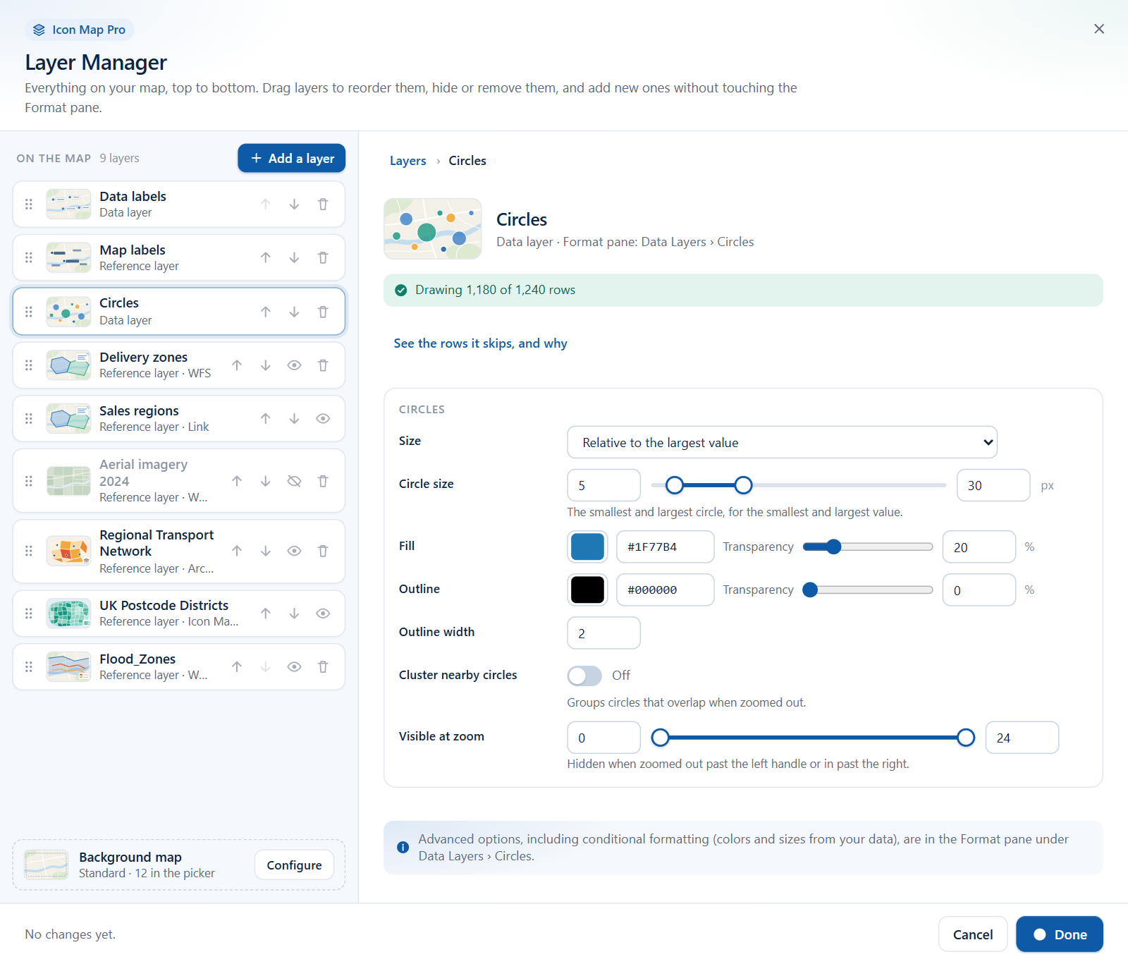
Every editor has the same shape:
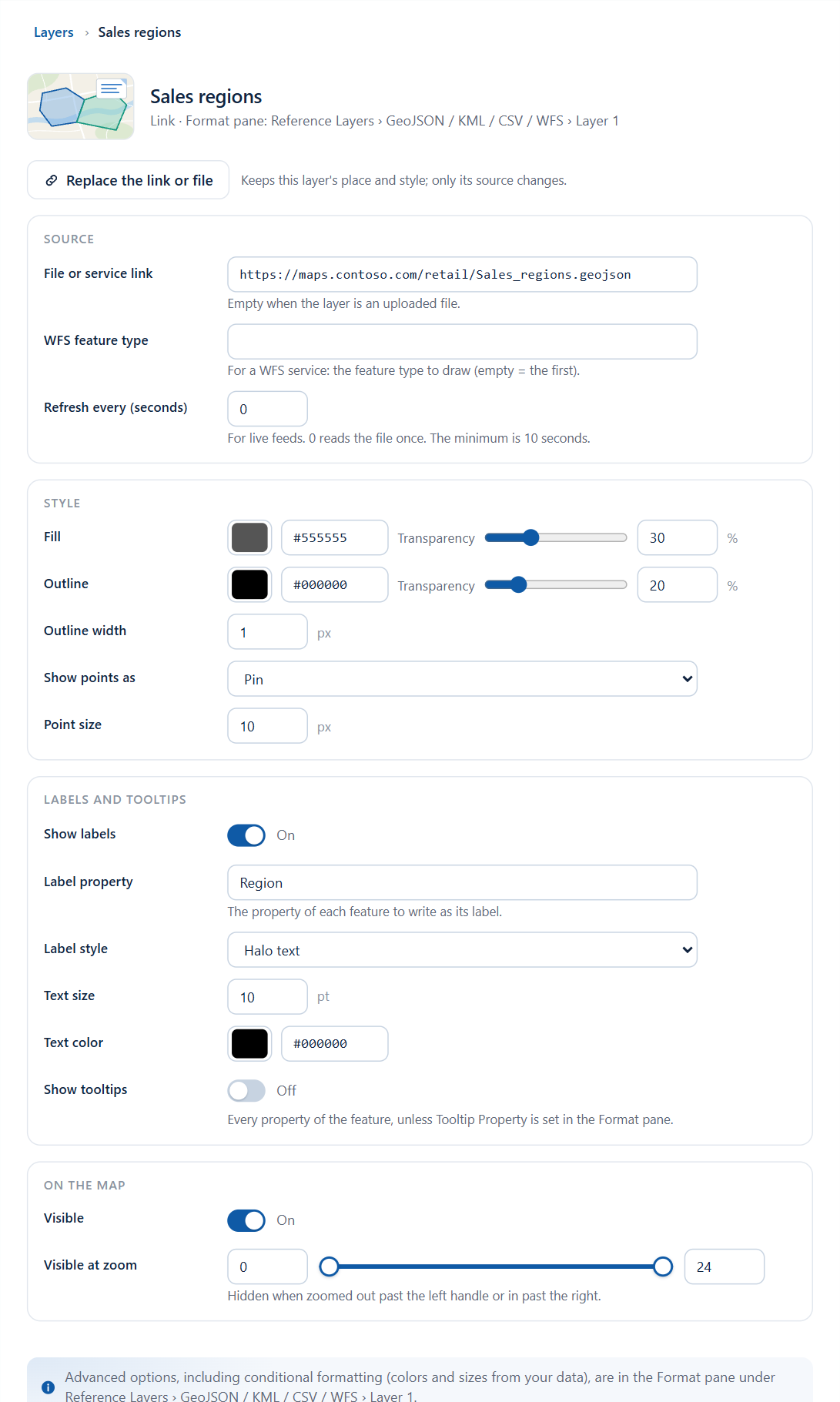
- The heading - the layer's name, and below it a line that starts with where the layer comes from, then "Format pane:" followed by the place in the Format pane that holds all of the layer's settings. For a reference layer the line starts with the kind of source, for example "Link · Format pane: Reference Layers › GeoJSON / KML / CSV / WFS › Layer 1". For a data layer such as Circles it reads "Data layer · Format pane: ...".
- Row status (data layers) - "Drawing all 1,240 rows", "Drawing 1,180 of 1,240 rows", or an explanation of why the layer draws nothing. See Check your data.
- A button to another window, for layers that are set up elsewhere: Open Browse ArcGIS, Open the Icon Map Catalog or Change the elevation data.
- Replace the link or file, for layers that come from a link or an upload.
- The fields, in sections.
- A note naming the place in the Format pane for advanced options and conditional formatting.
Each field you change counts as one change in the footer. Select Layers in the trail above the heading, or press Esc, to return to the home view.
The controls
| Control | How it works |
|---|---|
| Switch | On or Off. |
| Number box | Type a value. It is kept within the allowed range. |
| Slider | Drag, or type in the box beside it. |
| Range slider | Two handles on one slider, with a box at each end, for a smallest and a largest value. |
| Color | A color picker with a box for the hex code (#RRGGBB). Some colors have a Transparency slider on the same row. |
| Dropdown | Choose one option. |
| Picker | Choose one of several tiles with a picture and a line of explanation. |
| Text and link boxes | Type or paste. The value is taken when you press Enter or leave the box. |
Visible at zoom appears in most editors. It is a range slider from 0 to 24: the layer is hidden when the map is zoomed out past the left handle or in past the right handle.
Replace the link or file
Replace the link or file runs the add wizard again for the same layer. The layer keeps its place in the list and its style; only its source changes. When you finish, you return to the layer's editor. It is offered for Files & feeds, Tiles & imagery, WMS, Shapes (from files) and Vector tiles.
Editors for data layers
Circles
| Field | What it does | Default |
|---|---|---|
| Size | How the Circle Size field is used: Relative to the largest value, The value, in pixels or The value, in meters. | Relative to the largest value |
| Circle size | The smallest and largest circle, for the smallest and largest value, in pixels (0 to 100). Shown when Size is relative. | 5 to 30 |
| Fill and Transparency | Fill color and its transparency. | #1F77B4, 20% |
| Outline and Transparency | Outline color and its transparency. | #000000, 0% |
| Outline width | 0 to 100. | 2 |
| Cluster nearby circles | Groups circles that overlap when zoomed out. | Off |
| Visible at zoom | Zoom range. | 0 to 24 |
Images and icons
| Field | What it does | Default |
|---|---|---|
| Images come from | An image URL or SVG in your data, The icon library or One image URL for every point. | An image URL or SVG in your data |
| Image link | The image for every point. Shown for one image URL. | Empty |
| Icon name | An icon from the icon library, by name. Shown for the icon library. | Empty |
| Width | 0 to 1000 pixels. | 30 |
| Height | 0 to 1000 pixels. Not shown for the icon library. | 30 |
| Icon color | Shown for the icon library. | #000000 |
| Transparency | 0 to 100. | 0 |
| Cluster nearby images | Groups images that overlap when zoomed out. | Off |
| Visible at zoom | Zoom range. | 0 to 24 |
When circles and images are both on, each has its own row and its own editor. More in Images and icons.
Cluster order
When Cluster nearby circles or Cluster nearby images is on and a field is in Cluster Group, the Circles and Images & icons editors end with an Order of section, named after the field. A second Cluster Group field has a section of its own.
| Field | What it does | Default |
|---|---|---|
| Order | The order of the field's values in the cluster charts, the legend and the Format pane's color pickers. The same choices as Order in the Format pane. | As in the data |
| Direction | A to Z or Z to A, Ascending or Descending, or Largest first or Smallest first. Shown for the orders that have a direction. | A to Z, Ascending or Largest first |
| Values in order | The values in their order now, numbered, each with its color. Select Arrange by hand to start a custom order from it. With Custom, move a value with the arrows next to it. |
More in Cluster order.
Heatmap
| Field | What it does | Default |
|---|---|---|
| Radius | The radius of each point when zoomed out, and when zoomed in, in pixels (1 to 500). | 2 to 20 |
| Visible at zoom | Zoom range. | 0 to 24 |
More in Heatmap.
3D columns
| Field | What it does | Default |
|---|---|---|
| Shape | Square or Circle. | Square |
| Height | Relative to the largest value or The value, in meters. | Relative to the largest value |
| Column height | The height for the smallest and largest value, in meters (0 to 20,000). | 100 to 5000 |
| Width | 1 to 100,000 meters. | 100 |
| Color and Transparency | Column color and its transparency. | #1F77B4, 10% |
More in 3D columns.
Cells
| Section | Field | What it does | Default |
|---|---|---|---|
| Cells | Cells come from | The grid and the source: H3 - points aggregated into cells, H3 - cell ids in your data, S2 - points aggregated into cells, S2 - cell tokens in your data, A5 - points aggregated into cells, Geohash - points aggregated into cells, Geohash - cell ids in your data, Custom shapes - points counted in uploaded polygons. | H3 - points aggregated into cells |
| Cells | Aggregate values by | Sum, Count, Average, Minimum or Maximum. | Sum |
| Cells | Cell size | Fixed or Follows the zoom. | Fixed |
| Cells | Resolution | Higher is finer: H3 0 to 15, S2 and A5 0 to 30, Geohash 1 to 12. Shown when Cell size is fixed. | 3 |
| Colors | Low color, Mid color, High color | The colors for low, middle and high values. | #DEEBF7, #6BAED6, #08306B |
| Colors | Fill transparency | 0 to 100. | 10 |
| Colors | Outline and Transparency | Outline color and its transparency. | #000000, 10% |
| Colors | Outline width | 0 to 100 pixels. | 1 |
More in Cells: H3 hexagons and grids.
Lines & flows
| Field | What it does | Default |
|---|---|---|
| Style | A picker of seven line styles: see below. | Straight lines |
| Color and Transparency | Line color and its transparency. | #000000, 20% |
| Width | 0 to 100 pixels. | 2 |
| Arrowheads | Shown when the style is Animated flows, Flow map or 3D arcs. | On |
| Visible at zoom | Zoom range. | 0 to 24 |
The Style picker sets the same setting as Line Shape in the Format pane. The names differ between the two places:
| Tile in the Layer Manager | Line Shape in the Format pane |
|---|---|
| Straight lines | Straight |
| Great-circle arcs | Shortest |
| Animated flows | Flow |
| Flow map | Smoothed Flow |
| 3D arcs | Flow Arcs |
| Flow tree | Flow Tree |
| Routes (side by side) | Routes |
The 3D Arcs line shape is chosen in the Format pane. Each shape is described in Lines and Routes.
Shapes (from data)
| Field | What it does | Default |
|---|---|---|
| Fill and Transparency | Fill color and its transparency. | #1F77B4, 20% |
| Outline and Transparency | Outline color and its transparency. | #000000, 0% |
| Outline width | 0 to 100 pixels. | 2 |
| Show points as | Circle, Pin, Icon from the icon library or Image. | Circle |
| Point size | 0 to 500 pixels. | 5 |
| Visible at zoom | Zoom range. | 0 to 24 |
More in Shapes from data (WKT and GeoJSON).
Shapes (from files)
Replace the link or file is available.
| Section | Field | What it does | Default |
|---|---|---|---|
| Source | File or service link | The link. Empty when the layer is an uploaded file. | Empty |
| Source | Property to match your data | The property of each shape that holds the value in your Feature Reference field. A dropdown of the file's properties for an uploaded file, with Any property (slower) first; otherwise a text box, which you can leave empty to try every property. | Empty |
| Source | Hide shapes with no matching row | Draws only the shapes that match a row. | Off |
| Style | Fill and Transparency | Used when the layer has no color from your data. | #1F77B4, 1% |
| Style | Outline and Transparency | Outline color and its transparency. | #000000, 1% |
| Style | Outline width | 0 to 100 pixels. | 1 |
| On the map | Visible | Shows or hides the layer. | On |
| On the map | Visible at zoom | Zoom range. | 0 to 24 |
| On the map | Every property in the tooltip | Adds every property of the shape to its tooltip. | Off |
When the report uses the layers as drill-down levels, the row's detail line adds "drill-down level" and its number. More in Shapes from files.
Vector tiles
Replace the link or file is available.
| Section | Field | What it does | Default |
|---|---|---|---|
| Source | Tile link | The tile template, TileJSON link or PMTiles link. | Empty |
| Source | Source layer | The layer inside the tiles, as named by the tile server. | Empty |
| Source | Property to match your data | The tile property that holds the value in your Feature Reference field. Leave empty to try every property. | Empty |
| Source | Hide shapes with no matching row | Draws only the features that match a row. | Off |
| Style | Fill and Transparency | Fill color and its transparency. | #1F77B4, 1% |
| Style | Outline and Transparency | Outline color and its transparency. | #000000, 1% |
| Style | Outline width | 0 to 100 pixels. | 1 |
| On the map | Visible | Shows or hides the layer. | On |
| On the map | Visible at zoom | Zoom range. | 0 to 24 |
More in Vector tiles.
ArcGIS feature layer
The layer and the attribute to join on are chosen in Browse ArcGIS: select Open Browse ArcGIS.
| Field | What it does | Default |
|---|---|---|
| Visible | Shows or hides the layer. | On |
| Visible at zoom | Zoom range. | 0 to 24 |
| Use ArcGIS symbology | Draws the layer with its own ArcGIS styling. | Off |
| Use ArcGIS labels | Draws the layer's ArcGIS labels. | Off |
More in ArcGIS layers bound to data.
Catalog layers
Catalog layers are styled, filtered and bound to your data in the catalog window: select Open the Icon Map Catalog. The editor has one field, Visible. This applies to catalog layers used as data layers and as reference layers. More in Icon Map Catalog layers.
Data labels
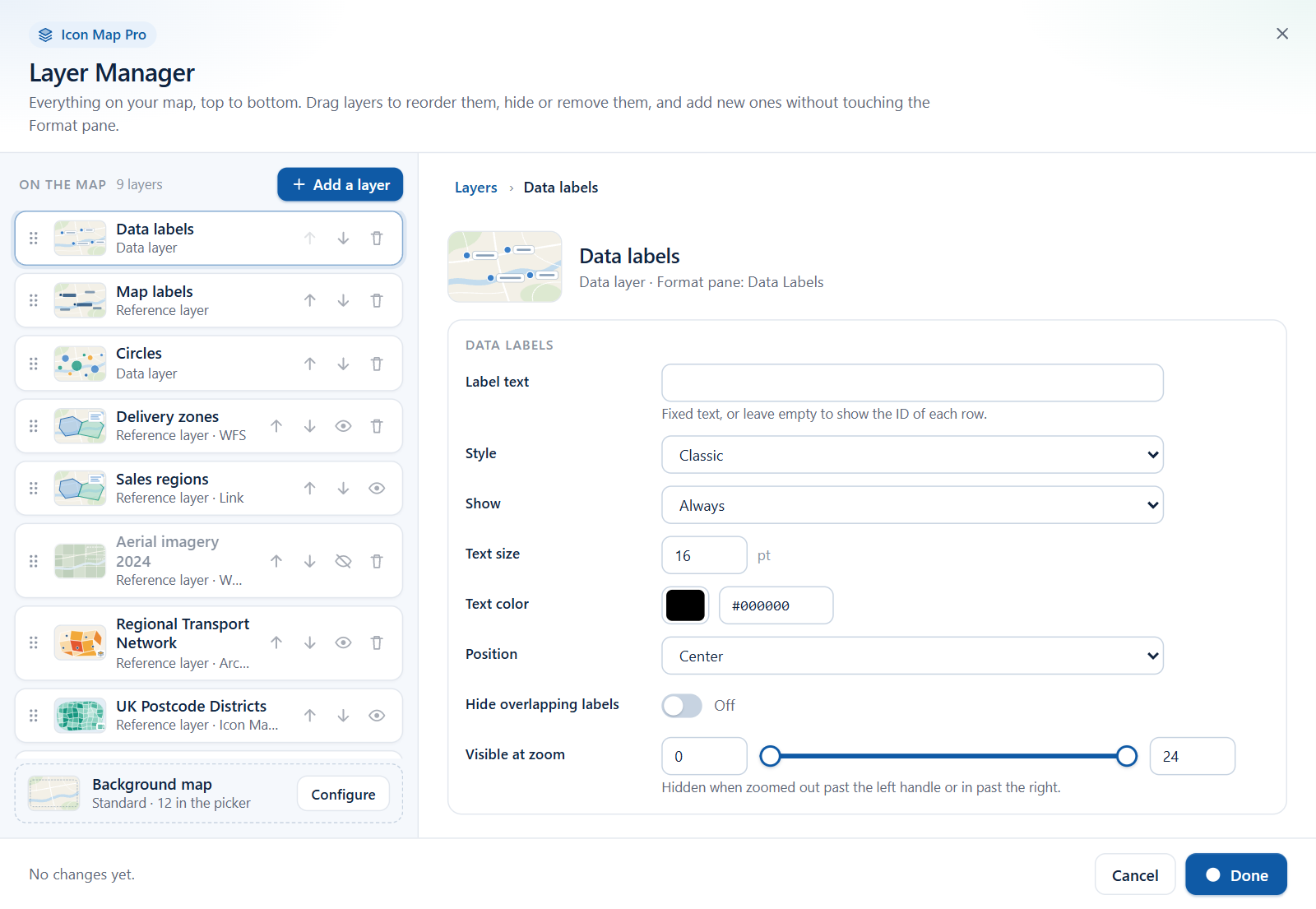
The Data labels row appears once labels are switched on in the Format pane (Format pane > Labels > Content > Display Label).
| Field | What it does | Default | Name in the Format pane |
|---|---|---|---|
| Label text | The text of the labels. To take the text from a field, use conditional formatting (fx) in the Format pane. | Empty | Label Text (Body Text for card styles) |
| Style | Classic, Halo text, Glass, Dark glass, Card or Neon. | Classic | Label Style |
| Show | Always, On mouse over or When selected. | Always | Label Visibility |
| Text size | 0 to 100 points. | 16 | Font Size (min zoom) |
| Text color | The color of the text. | #000000 | Text Color |
| Position | Center, Above, Below, Left or Right. | Center | Position (circles & images) |
| Hide overlapping labels | Hides labels that would collide. | Off | Avoid Overlapping |
| Visible at zoom | Zoom range. | 0 to 24 | Visible From Zoom, Visible To Zoom |
The editor heading gives the place in the Format pane as "Data Labels". The card is named Labels. More in Data labels.
Editors for reference layers
Files & feeds
Replace the link or file is available.
| Section | Field | What it does | Default |
|---|---|---|---|
| Source | File or service link | The link. Empty when the layer is an uploaded file. | Empty |
| Source | WFS feature type | For a WFS service: the feature type to draw. Empty draws the first. | Empty |
| Source | Refresh every (seconds) | For live feeds. 0 reads the file once. The minimum is 10 seconds; the maximum 86,400. | 0 |
| Style | Fill and Transparency | Fill color and its transparency. | #555555, 30% |
| Style | Outline and Transparency | Outline color and its transparency. | #000000, 20% for the first layer, 0% for the others |
| Style | Outline width | 0 to 100 pixels. | 1 |
| Style | Show points as | Circle, Pin, Icon from the icon library or Image. | Pin |
| Style | Point size | 0 to 200 pixels. | 10 |
| Labels and tooltips | Show labels | Labels each feature. | Off |
| Labels and tooltips | Label property | The property of each feature to write as its label. Shown when labels are on. | Empty |
| Labels and tooltips | Label style | Halo text, Glass, Dark glass, Card or Neon. Shown when labels are on. | Halo text |
| Labels and tooltips | Text size | 0 to 100 points. Shown when labels are on. | 10 |
| Labels and tooltips | Text color | Shown when labels are on. | #000000 |
| Labels and tooltips | Show tooltips | Shows every property of the feature, unless Tooltip Property is set in the Format pane. | Off |
| On the map | Visible | Shows or hides the layer. | On |
| On the map | Visible at zoom | Zoom range. | 0 to 24 |
More in Files and feeds: GeoJSON, KML, CSV, WFS and Labels on reference layers.
Tiles & imagery
Replace the link or file is available.
| Section | Field | What it does | Default |
|---|---|---|---|
| Source | Tile template or WMTS link | The link. | Empty |
| Source | Cloud Optimized GeoTIFF | On for a GeoTIFF link. | Off |
| Source | Tile size | 256 for most tile servers; 512 for retina tiles. 256 to 4096 pixels. | 256 |
| On the map | Visible | Shows or hides the layer. | On |
| On the map | Transparency | 0 to 100. | 20 for the first layer, 0 for the others |
| On the map | Visible at zoom | Zoom range. | 0 to 22 for the first layer, 0 to 24 for the others |
WMS
Replace the link or file is available.
| Section | Field | What it does | Default |
|---|---|---|---|
| Source | WMS service address | The link. | Empty |
| Source | Layer | The layer's name in the service. Use Replace the link or file to pick one from the service's list. | Empty |
| Source | Image format | PNG, JPEG or SVG. | PNG |
| On the map | Visible | Shows or hides the layer. | On |
| On the map | Transparency | 0 to 100. | 10 for the first layer, 0 for the others |
| On the map | Visible at zoom | Zoom range. | 0 to 24 |
More on both in Raster tiles, WMTS and WMS.
ArcGIS
The layer, service or web map is chosen in Browse ArcGIS, where you can also change which layers of a web map are drawn: select Open Browse ArcGIS.
| Field | What it does | Default |
|---|---|---|
| Visible | Shows or hides the layer. | On |
| Transparency | 0 to 100. Applies to map, image and vector tile services and web maps; feature layers use their own styling. | 0 |
| Visible at zoom | Zoom range. | 0 to 24 |
| Use ArcGIS symbology | Draws a feature layer with its own ArcGIS styling instead of the colors in the Format pane. | |
| Use ArcGIS labels | Draws the layer's ArcGIS labels. | |
| Use ArcGIS pop-ups | Tooltips show the layer's ArcGIS pop-up fields. | |
| Pop-up on click | Clicking a feature opens its ArcGIS pop-up, with images, charts, attachments and related records. | Off |
A report built with the earlier, single ArcGIS reference layer shows that layer in the list, but it has no editor here. The row says where to find it in the Format pane. More in ArcGIS layers.
Weather
| Section | Field | What it does | Default |
|---|---|---|---|
| Weather | Provider | OpenWeatherMap (Basic) or OpenWeatherMap (Advanced). | OpenWeatherMap (Basic) |
| Weather | Layer | Basic: Clouds, Precipitation, Sea level pressure, Wind Speed, Temperature. Advanced: Precipitation intensity, Convective precipitation, Accumulated precipitation, Depth of snow, Wind speed at an altitude of 10 meters, Joint display of speed wind (color) and wind direction (arrows), Atmospheric pressure on mean sea level, Air temperature at a height of 2 meters, Temperature of a dew point, Relative humidity, Cloudiness. | Precipitation |
| Weather | Transparency | 0 to 100. | 10 |
| API key | OpenWeatherMap API key | Your key. It is saved under API Keys in the Format pane. | Empty |
Traffic
| Section | Field | What it does | Default |
|---|---|---|---|
| Traffic | Layer | Traffic Flow - relative, Traffic Flow - absolute, Traffic Flow - relative delay, Traffic Flow - reduced sensitivity, Traffic Incident - S1, Traffic Incident - S2, Traffic Incident - S3, Traffic Incident - Night. | Traffic Flow - relative |
| API key | Azure Maps key | Your key. It is saved under API Keys in the Format pane. | Empty |
Map labels
| Field | What it does | Default |
|---|---|---|
| Source | Icon Map or Azure Maps. Azure Maps labels need an Azure Maps key. | Icon Map |
| Visible at zoom | Zoom range. | 0 to 24 |
More in Map labels on top of your data.
Day and night
| Field | What it does | Default |
|---|---|---|
| Style | Single or Banded. | Single |
| Bands | 1 to 36. Shown when the style is banded. | 4 |
| Color and Transparency | The shade and its transparency. | #000000, 70% |
More on these three in Weather, traffic and daylight.
Hillshade
The Hillshade row appears when hill shading is on. On a map with a basemap list, the editor names the elevation data the hillshade is drawn from, and Change the elevation data opens the Basemaps dialog to choose another source.
| Field | What it does | Default |
|---|---|---|
| Visible | Shows or hides the hillshade. | On |
| Exaggeration | 0 to 10. | 2 |
| Light direction | 0 to 360 degrees. | 335 |
| Shadow color | The color of the shaded slopes. | #000000 |
| Highlight color | The color of the lit slopes. | #FFFFFF |
More in Terrain, hillshade, sky and lighting.
Vector style
One field: Style link, the link to a MapLibre style JSON. A vector style layer cannot be added in the Layer Manager; the row appears for reports that already have one.
What stays in the Format pane
The editors show the settings most maps need. Everything else, and everything that takes its value from your data, is in the Format pane. Each editor's heading and closing note name the place.
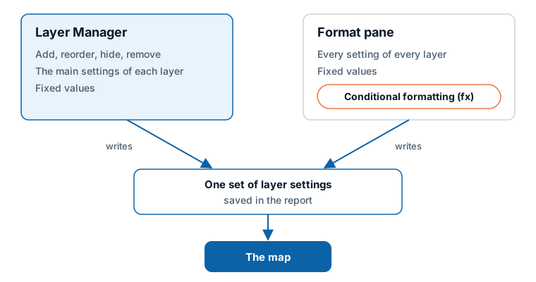
Conditional formatting (fx). The Layer Manager sets one fixed value for each setting: one fill color for all circles, one width for all lines. To color, size or switch things per row from a field or a measure, use the fx button beside the setting in the Format pane. If a setting already uses conditional formatting, change it in the Format pane. See Conditional formatting.
Advanced options. These are examples of what the editors leave to the Format pane:
| Layer | In the Format pane only |
|---|---|
| All layers | Conditional formatting; the Z-Index number itself; selection, tooltip and auto zoom options for the layer |
| Circles | Cluster appearance and behavior |
| Lines & flows | Width from your data, dashes, line symbols, images at the ends of a line, gradient colors, the 3D Arcs line shape |
| Shapes (from data) | Extrusion in 3D, fill patterns, line symbols, icons and images for points |
| Shapes (from files) | Colors for shapes with no matching row, simplification, 3D, drill-down or side by side |
| Vector tiles | Colors for features with no matching row, drill-down or side by side |
| ArcGIS feature layer | Fill and outline colors |
| Data labels | Switching labels on, title, image and footer, fonts, the label container, pointer and orientation |
| Files & feeds | Filters, the tooltip property, colors from a property, detailed label settings |
| WMS | Authentication, styles, filters and custom parameters |
| Catalog layers | Set in the Icon Map Catalog window |
For where each card and group is, see the Format pane map.
Where the editor's "Format pane:" line points
The line in each editor's heading uses short names. These are the cards they refer to:
| The editor says | Card in the Format pane |
|---|---|
| "Data Layers › ..." | Data Layers |
| "Reference Layers › ..." | Reference Layers |
| "Data Labels" | Labels |
| "Catalog › Configure Layers" | Catalog, group Catalog Layers, Configure Layers |
| "Background › Hillshade" | Background Layer |
Tips and limits
- Nothing changes in the report until you select Apply changes. Cancel discards the changes made since the dialog opened, except those saved before another window opened. See Windows that open on the way.
- Removing a layer keeps its settings. Hiding a layer keeps its place as well.
- For the types you can add several of, only the last layer can be removed.
- Layers cannot be renamed or duplicated in the Layer Manager.
- Colors are entered as six-digit hex codes, for example #1F77B4.