

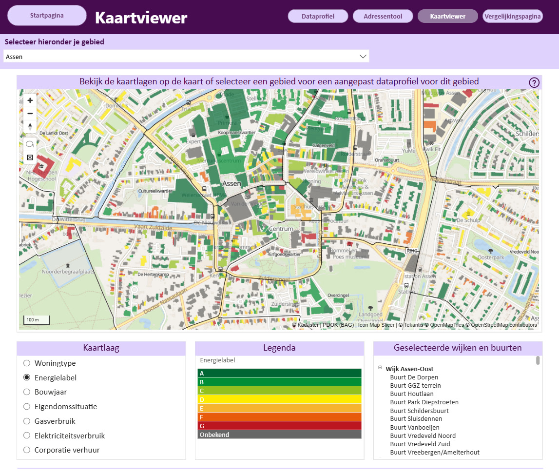
Turning Every Building in Drenthe Into a Filterable Energy Map
For the Province of Drenthe, seeing energy data building by building opens up a much clearer picture of what is happening on the ground.
Industry solutions · Aviation
Airports and airlines run on where things are: aircraft on approach, on the runway, on stand; tugs, fuel and baggage around them; a fleet spread across the world. Icon Map puts all of it on one live, interactive map, inside the Power BI reports and Microsoft Fabric workspaces you already use.
Real traffic at London Heathrow, recorded from adsb.lol · 3D aircraft in Icon Map for Fabric
Operations you can see
Flight tracks, stand allocations, turnaround milestones, ground vehicle telemetry and schedules already sit in your data platform. Icon Map shows them where they happen, so an operations team sees the airfield, not a table: which runway is in use, who is holding, how long departures are taxiing, where the stands are filling up.
Build operational and network reports in Power BI with Icon Map Pro, or bring live feeds, 3D aircraft and playback together in Microsoft Fabric with Icon Map for Fabric.
Airport operations · London Heathrow
Real traffic at Heathrow, recorded from public ADS-B data and replayed as 3D aircraft: arrivals on the approach to 27L, departures rolling on 27R, aircraft taxiing and on stand, with tugs, fuel and baggage around them. Click any aircraft to follow it.
Aircraft positions: ADS-B data recorded around London Heathrow from adsb.lol (open data under the ODbL), replayed with each aircraft interpolated between its reported positions, speeds and tracks, and snapped to the taxiway centerlines on the ground. Tails are painted in each airline's colors (simple designs, not the airlines' own tail art); trails show arrivals and departures. The ground vehicles are simulated around the real aircraft movements. The airfield (runways, taxiways, aprons, stands and terminals) is drawn from Icon Map's built-in basemap data. 3D models, playback and the time slider are features of Icon Map for Fabric.
Icon Map Pro for Power BI
Two pages from a live Power BI report built with Icon Map Pro. Kestrel Atlantic is a fictional airline flying real aircraft movements recorded from public ADS-B data; its schedule, delays and passengers are simulated.
Every aircraft at the chosen time: where it is, the track it has flown and a dotted line on to its destination, over the night side of the globe drawn for that moment by the map's Time field. Pick another slot and the planes, cards and table move together.
Open full screenAn indoor model of Heathrow Terminal 3 made of extruded shapes in Power BI: check-in, security, lounges, gates and the aircraft on their stands, built from OpenStreetMap. Turnaround rings and gate cards flag the flights at risk of missing on-time departure, and clicking one in the exceptions table picks it out on the map.
Open full screenAircraft positions: adsb.lol (open data under the ODbL). Terminal building, shops, gates and stands: OpenStreetMap contributors. Interior layout drawn by hand; passenger numbers, queues and turnaround milestones are simulated.
How it works
ADS-B and multilateration feeds, ground vehicle telematics and stand systems flow into Fabric through Eventstream, or sit in your Lakehouse and Warehouse for history.
Eventstream · Eventhouse · OneLakeRunways, taxiways, aprons and stands from the basemap or the Icon Map Catalog, your own stand plans and CAD, and 3D models for every aircraft type and vehicle.
Built-in basemaps · Icon Map Catalog · your modelsWatch the airfield live or replay any period, follow an aircraft, and measure runway use, taxi times and stand occupancy with every chart in the report filtering together.
Icon Map for Fabric · Icon Map ProAcross airports and airlines
Arrivals, departures and ground movements on one map, with runway use, holding and taxi times measured as they happen.
Stand occupancy, turnaround milestones and delays by stand and pier, with the ground handling fleet around each aircraft.
Track tugs, fuel bowsers, buses and baggage tractors, see utilization by area, and spot vehicles where they should not be.
Routes as great circles on a 3D globe, sized by passengers or revenue, with the fleet's positions and utilization beside them.
Map delay by origin, route, runway and stand, and drill from the network to the turnaround that caused it.
Flight tracks against noise monitors, residential areas and the population around the airport, from your data and the Icon Map Catalog.
Restricted zones, runway incursions and incident locations in spatial context, for investigation and regulatory reporting.
Passenger flows, queues and retail across terminal floors, alongside the airside operation that drives them.
Our customer success stories
For the Province of Drenthe, seeing energy data building by building opens up a much clearer picture of what is happening on the ground.

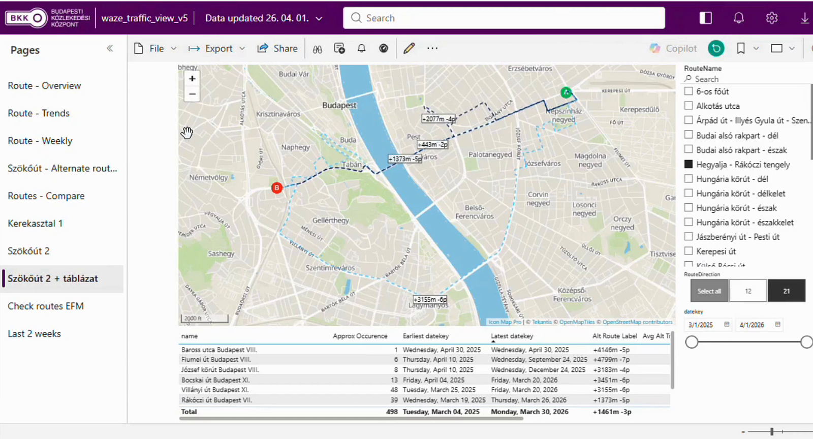
BKK, the Centre for Budapest Transport, is the organization behind the trams, buses and trolleybuses that move people around Hungary's capital, and its remit reaches well past the vehicles themselves. It also coordinates the city's shared bikes and e-scooters…

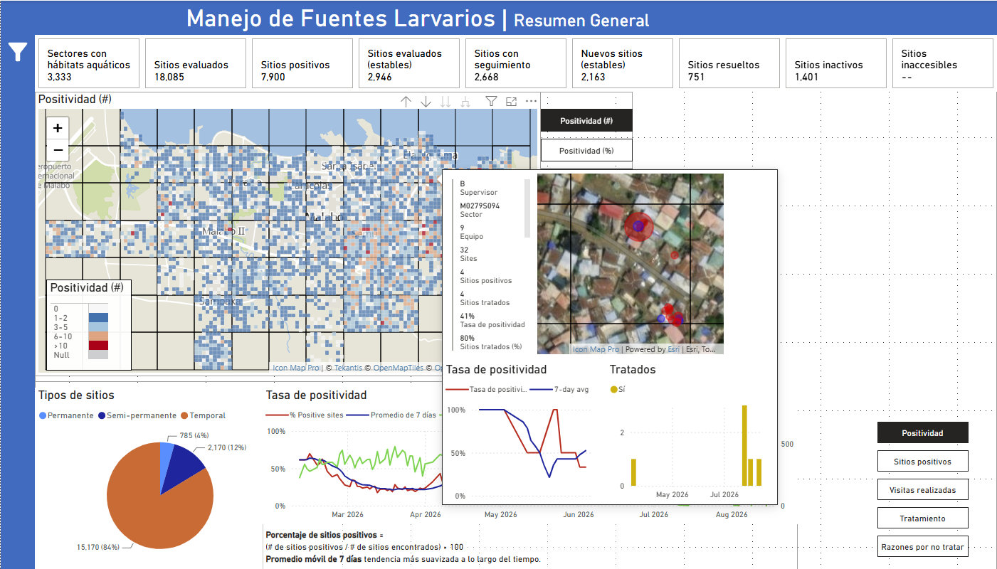
MCD Global Health is a public health nonprofit headquartered in Maine, working across more than 50 countries to design and implement health programmes that genuinely change lives. Their international work spans malaria, cervical cancer, health systems strengt…
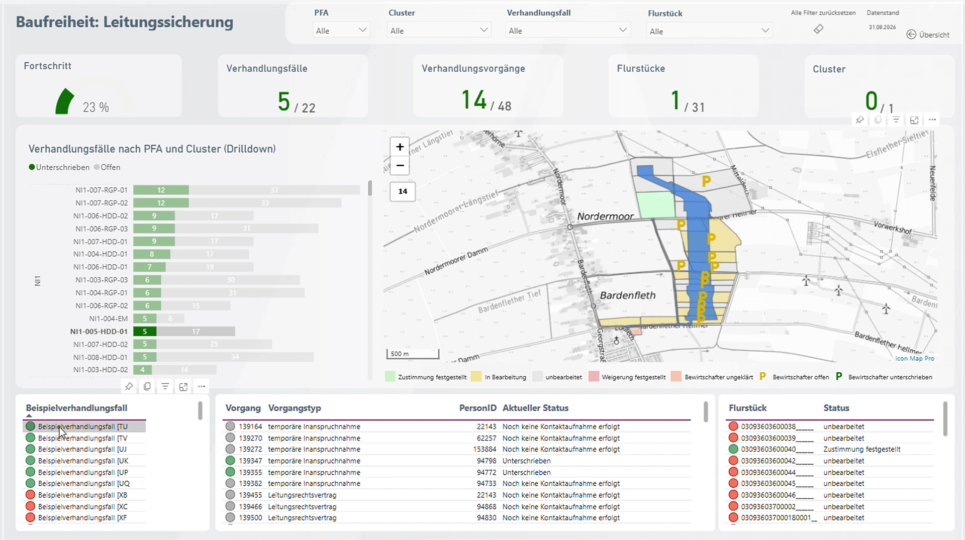
Amprion is one of Germany’s four transmission system operators, responsible for operating and expanding a critical part of Germany’s high-voltage electricity grid. Among its major infrastructure programmes is the Rhein-Main-Link, a planned underground HVDC c…

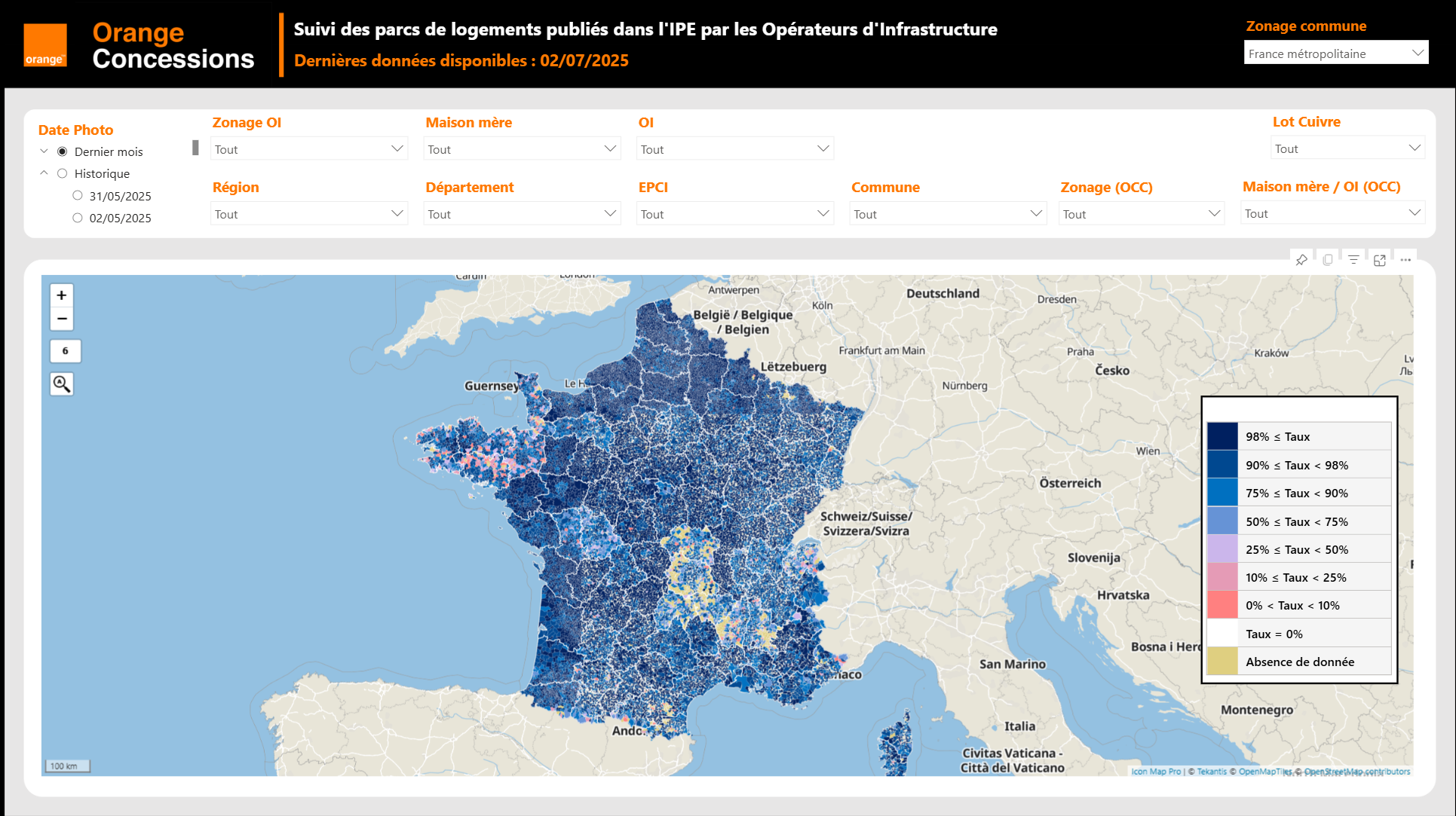
Orange Concessions is the leading public-private fiber network operator in rural France. Through long-term public service delegation contracts, it manages a rapidly expanding network infrastructure designed to bring high-speed broadband access to underserved…

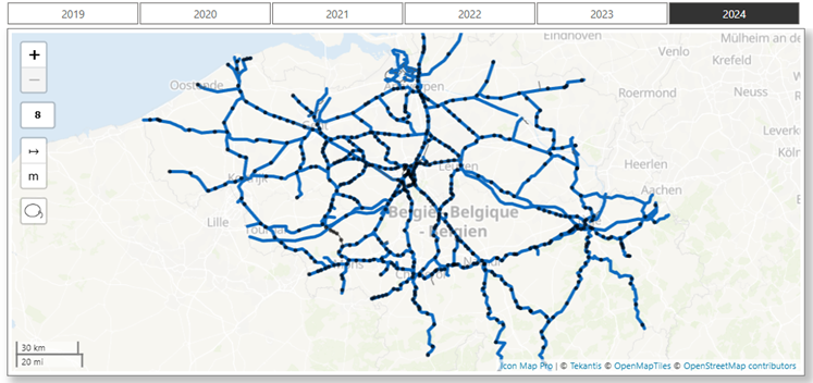
Safety is a cornerstone of SNCB’s operational strategy. As Belgium’s national railway operator, SNCB places significant emphasis on the safety and security of both passengers and staff. CEO Sophie Dutordoir recently stated that all employees' work "deserves r…
Build operational and network reports in Power BI with Icon Map Pro, or bring live feeds, 3D aircraft and playback together in Microsoft Fabric with Icon Map for Fabric.