
Clusters
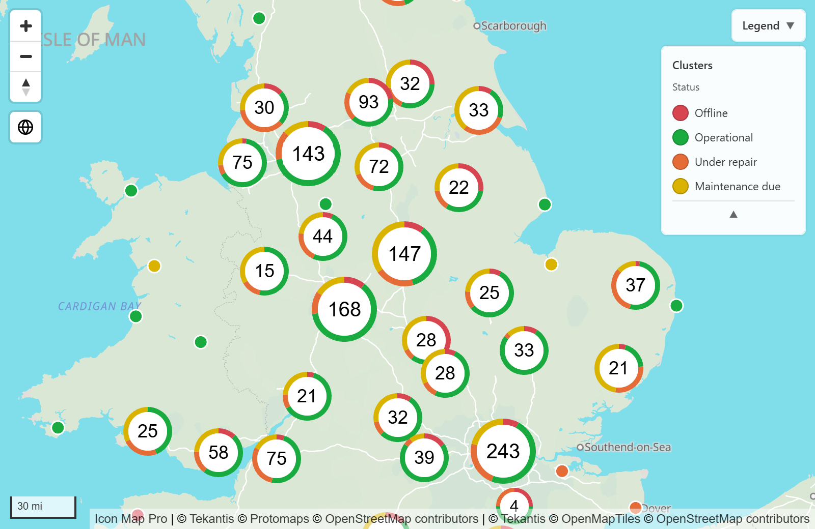
Clustering groups circles or images that are close together into one marker showing how many points it holds. Add a category and each cluster becomes a small chart of what is inside it. As you zoom in, clusters split into smaller clusters and then into the individual points.
What you need
Clusters are an option of the Circles and Images and icons layers, so start with one of those drawing on the map.
| Field well | What to put in it |
|---|---|
| The fields for circles or images | See the page for that layer |
| Cluster Group (optional) | A category, such as a status or type. Each cluster is split by it. A second field here adds a second chart to each cluster. |
Without a Cluster Group field, each cluster shows the number of points in it.
Turn clustering on
The quickest way is the Layer Manager:
- In the Format pane, expand Layer Manager and switch on Open Layer Manager.
- Select the Circles row and switch on Cluster nearby circles, or select the Images & icons row and switch on Cluster nearby images.
- Select Apply changes.
For every other cluster setting, use the Format pane:
- In the Format pane, expand Data Layers.
- For circles, expand Circles - Configuration and switch on Cluster circles. For images, expand Images - Configuration and switch on Cluster Images.
- To split clusters by category, add a field to Cluster Group.
- Expand Cluster - Configuration to choose the cluster type and how clusters behave.
Circles and images share one set of cluster settings. When both layers are clustered, a cluster can hold both.
Cluster types
Cluster Type sets how each cluster is drawn.
| Cluster Type | What it draws |
|---|---|
| Donut | A ring with a segment for each Cluster Group value and the total in the middle. |
| Pie | A pie with a slice for each Cluster Group value. |
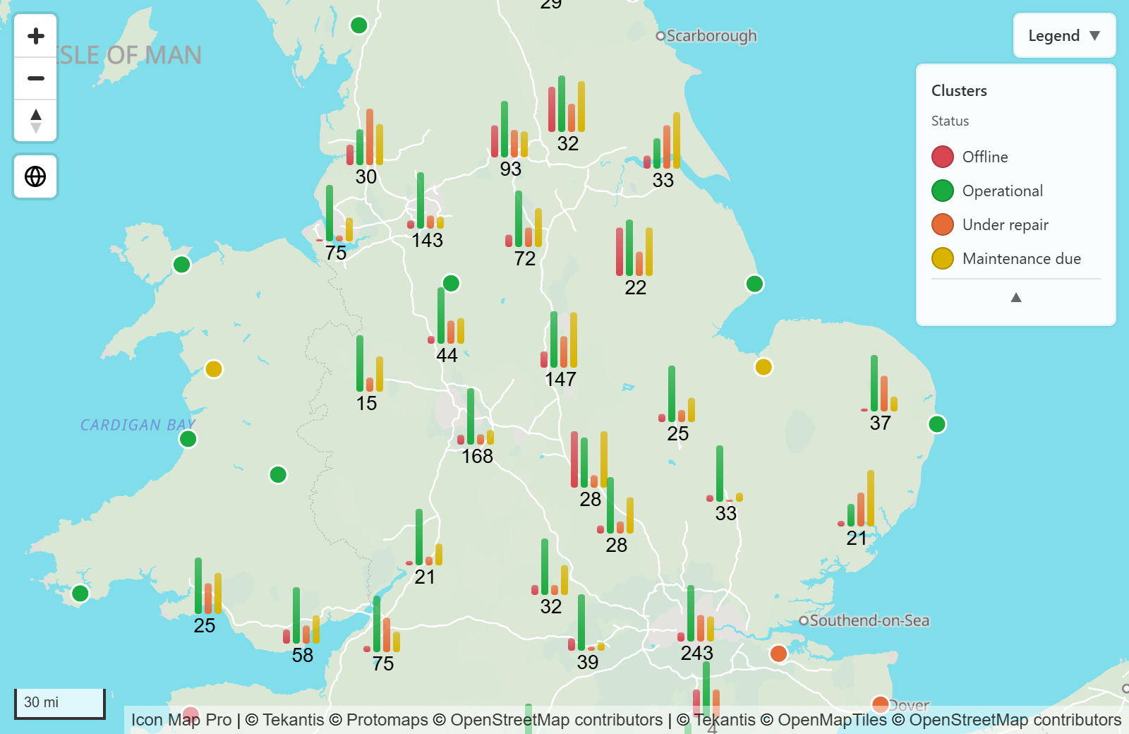
| Bar Chart | Horizontal bars, one for each Cluster Group value, with the total beside the chart. |
| Column Chart | Vertical bars, one for each Cluster Group value, with the total under the chart. |
| Square (single color) | A square in one color with the total in the middle. It does not show the Cluster Group split. |
| Teardrop (single color) | A map pin shape in one color with the total in the middle. It does not show the Cluster Group split. |
Unless you fix the size, donut, pie, square and teardrop clusters grow with their total, in four steps: under 10, 10 or more, 100 or more, and 1,000 or more.
Cluster colors
With a field in Cluster Group, Color Source for Cluster Groups decides where each category's color comes from.
| Option | What it does |
|---|---|
| One color per value | A color picker appears for each category, labeled with its value. New categories start with your report theme's colors. Pickers are shown for the first 20 categories. |
| From a field or rule | One Color picker with an fx button. Use conditional formatting to take the color from a field or a rule. Each category takes the color of its first row. |
The same colors are used for the cluster charts, for the legend, for circles when Fill Color set by cluster is on, and for library icons when Use Cluster Color is on. That keeps a point the same color whether it is inside a cluster or on its own.
Cluster order
With a field in Cluster Group, Order sets the order of its values: the bars of a bar or column chart, the segments of a donut or pie, the entries in the legend and the color pickers in the Format pane all follow it.
| Order | What it does |
|---|---|
| As in the data | The order in which the values first appear in the rows the visual receives. This order can change when the report is filtered. |
| Alphabetical | A to Z. Numbers are put in numeric order, so 2 comes before 10. |
| Smart (days, months, numbers) | Alphabetical, except that days of the week run Monday to Sunday, months run January to December, and Low, Medium, High (and Small, Medium, Large, and XS to XXL) run in that order. Day and month names are recognized in full or abbreviated, in English, German, Spanish, French and Portuguese. |
| Custom | The values in the order you type them in Custom order. Values you leave out follow, A to Z. |
| By total value | By each value's total across the map: the number of points, or the sum of Circle Size when Use values in circles size field as counts is on. |
| By value in each cluster | Each cluster puts its own values in order of their count, so each chart can have a different order. The legend and the color pickers use the order by total value. Offered for the donut, pie, bar and column chart types. |
Direction appears for the orders that have one: A to Z or Z to A for Alphabetical, Ascending or Descending for Smart, and Largest first or Smallest first for the two value orders.
For Custom order, separate the values with commas, for example Sunday, Monday, Tuesday. Upper and lower case do not matter. Put a value that contains a comma in double quotes, for example "London, UK". While the box is empty it shows your field's values, spelled as your data spells them.
- Choosing an order never changes a value's color.
- Blank values always come last.
- Max Bars keeps the bars at the start of the order. With By total value and Largest first, every cluster shows the same top values.
- The week starts on Monday for everyone who views the report. For Sunday first, use Custom.
In the Layer Manager, select the Circles or Images & icons row with clustering on. The Order of section, named after your Cluster Group field, has the same Order and Direction, and lists the values in their order with their colors. Select Arrange by hand to move values up and down with the arrows next to each one. This sets Order to Custom.
Example: one bar for each day of the week
- Put the day name field in Cluster Group.
- In Cluster - Configuration, set Cluster Type to Column Chart.
- Set Order to Smart (days, months, numbers).
Every cluster now shows its bars from Monday to Sunday.
Click and hover behavior
| Setting | What happens |
|---|---|
| Zoom on Click | Selecting a cluster zooms the map to fit the points inside it. On by default. |
| Select on Click | Selecting a cluster selects its points, which cross-filters or cross-highlights the report page. Up to the first 100 points in a cluster are selected. Hold Ctrl to add to the selection. Off by default. |
| Show Tooltips | Pointing at a cluster shows each Cluster Group value and its count. Without a Cluster Group field it shows Count and the number of points. On by default. |
| Include Polygon | Pointing at a cluster shades the area its points cover. On by default. |
Zoom on Click and Select on Click can both be on.
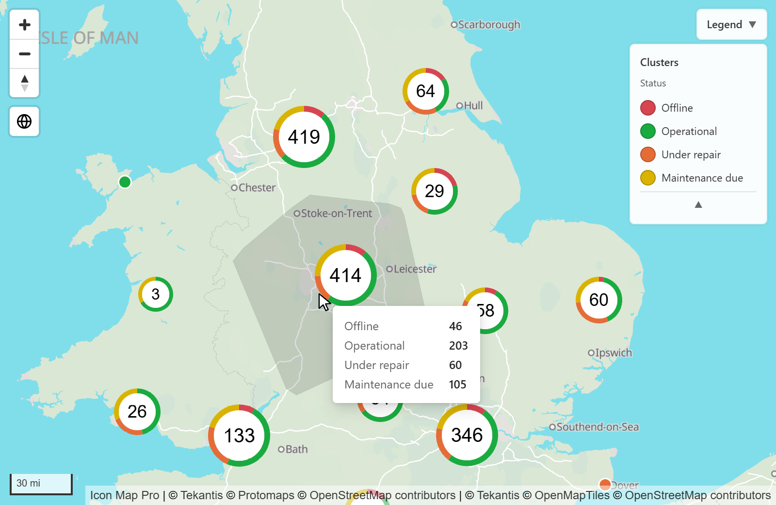
When something is selected, in the map or elsewhere on the report page, clusters that hold a selected point stay bright and the others fade, using the transparency values in the Interactivity card.
Settings
All of these are in Format pane > Data Layers. The Cluster - Configuration group appears when Cluster circles or Cluster Images is on for a layer that is turned on.
Cluster - Configuration
| Setting | What it does | Default |
|---|---|---|
| Cluster Type | How clusters are drawn. See Cluster types. | Donut |
| Max Bars | The most bars a bar or column chart shows. 1 to 20. | 10 |
| Rounded Bars | Rounds the corners of the bars. | Off |
| Bar Fade | Fades each bar along its length. 0 is solid. 0 to 100. | 70 |
| Fixed Size | Square and teardrop: draws every cluster the same size. | Off |
| Size | Square and teardrop with Fixed Size on: how large each cluster is. 2 to 300. | 80 |
| Fixed Circle Size | Donut and pie: draws every cluster the same size. | Off |
| Circle Size | Donut with Fixed Circle Size on: the size in pixels. 30 to 300. | 80 |
| Background Color | Donut: the color of the center. Square and teardrop: the fill color. | #FFFFFF |
| Background Transparency | Transparency of the background. 0 to 100. | 0 |
| Outline / Donut Width | Donut: thickness of the ring. 1 to 9. | 2 |
| Default Outline Color | Donut: the ring color when there is no Cluster Group field. | #FFFFFF |
| Outline Color | Square and teardrop: color of the outline. | #FFFFFF |
| Outline Width | Square and teardrop: width of the outline. 0 to 10. | 0 |
| Show Pie Outline | Pie: draws an outline. | Off |
| Pie Outline Color | Pie with Show Pie Outline on: the outline color. | #FFFFFF |
| Text Color | Color of the total. | #000000 |
| Show Total | Shows the total on each cluster. | On |
| Show Tooltips | Shows a tooltip when you point at a cluster. | On |
| Zoom on Click | Zooms to the cluster's points when you select it. | On |
| Select on Click | Selects the cluster's points when you select it. | Off |
| Minimum Points to Cluster | The fewest points that form a cluster. 2 to 1000. | 2 |
| Cluster Radius | How far apart points can be on screen and still be grouped. Higher gives fewer, larger clusters. 10 to 1000. | 100 |
| Max Cluster Zoom Level | Points are not clustered when the map is zoomed in past this level. 0 to 24. | 24 |
| Use values in circles size field as counts | Totals and segments add up the Circle Size values instead of counting points. An image counts as 1. | Off |
| Include Polygon | Shades the area a cluster covers when you point at it. | On |
| Polygon Color | Color of that shaded area. | #555555 |
| Order | The order of the Cluster Group values. Shown with a field in Cluster Group. See Cluster order. | As in the data |
| Direction | A to Z or Z to A, Ascending or Descending, or Largest first or Smallest first, depending on Order. | A to Z, Ascending or Largest first |
| Custom order | The values in order, separated by commas. Shown when Order is Custom. | Empty |
| Color Source for Cluster Groups | One color per value or From a field or rule. See Cluster colors. | One color per value |
| Color | The color, with fx, when the source is From a field or rule. | #118DFF |
Circles that are not in a cluster
In Circles - Formatting, Fill Color set by cluster is on by default. With a field in Cluster Group, circles that are not part of a cluster take their category's cluster color instead of Fill Color. Rows with no category keep Fill Color. Turn it off to color those circles with Fill Color and its conditional formatting.
Secondary Cluster - Configuration
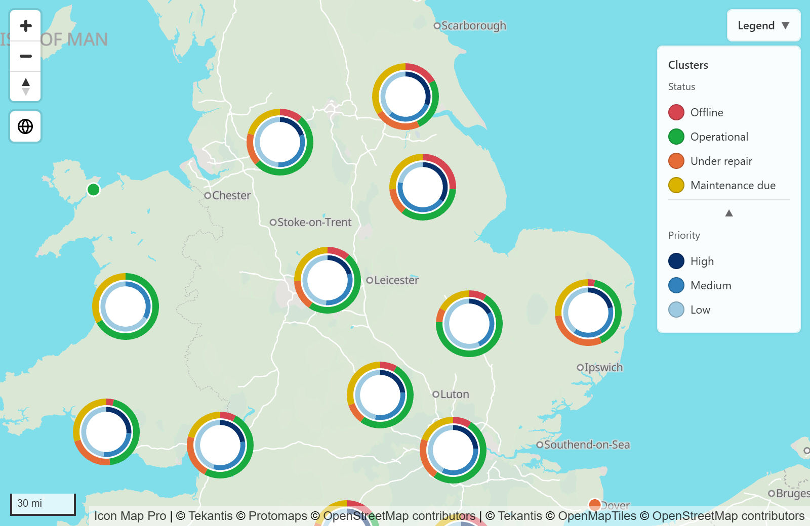
Add a second field to Cluster Group to draw a second chart on each cluster, for example status as the first field and priority as the second. The Secondary Cluster - Configuration group then appears, with its own Cluster Type, sizes, colors, Text Color, Show Total, Show Tooltips and Color Source for Cluster Groups. These work as they do for the main cluster.
The second field has its own Order, Direction and Custom order too.
| Setting | What it does | Default |
|---|---|---|
| Show Inside Primary Cluster | For a donut or pie: draws the second chart in the middle of the first instead of beside it. | Off |
| Gap | Space between the two charts when one is inside the other. 0 to 10. | 1 |
With Show Inside Primary Cluster on, clusters no longer grow with their total. Switch on Fixed Circle Size and set Circle Size to choose how large they are.
Without Show Inside Primary Cluster, the second chart is drawn to the right of the first. The tooltip lists the first field's values, then the second field's.
Tips and limits
- Cluster Group is summarized like a measure, so each ID must belong to one category. If the same ID appears with two categories, make the ID unique for each location and category.
- Clusters do not carry data labels. Use Show Total for the number on the cluster.
- Clusters follow the tilt settings of their layer: circle clusters follow the Circles Pitch Alignment, image clusters follow the Images Pitch Alignment and Rotation Alignment.
- To keep points separate once the map is zoomed in, lower Max Cluster Zoom Level.
- To make only large groups cluster, raise Minimum Points to Cluster.
- Offset Overlapping Images applies to images that are not in a cluster.
- Clusters of images are drawn at the Images Z Index. When circles are clustered too, every cluster is drawn at the Circles Z Index.