
Build your first map
This tutorial takes about 15 minutes. You start with an empty visual and a ten-row table, and finish with a map of circles sized and colored by sales, on a basemap you chose, with labels and tooltips.
Before you start
You need:
- Power BI Desktop, with Icon Map Pro added to your report. See Add Icon Map Pro to a report.
- A license. The free developer license is enough. See Free trial and developer license.
Step 1: Create the sample data
- In Power BI Desktop, select Home > Enter data.
- Copy the table below, select the first cell of the grid in the Create Table window, and paste.
- If Power BI does not pick up the column names, select Use first row as headers.
- Name the table
Storesand select Load.
| City | Latitude | Longitude | Sales | Category |
|---|---|---|---|---|
| Seattle | 47.6062 | -122.3321 | 420 | Retail |
| San Francisco | 37.7749 | -122.4194 | 610 | Online |
| Los Angeles | 34.0522 | -118.2437 | 880 | Retail |
| Denver | 39.7392 | -104.9903 | 310 | Wholesale |
| Dallas | 32.7767 | -96.7970 | 540 | Retail |
| Chicago | 41.8781 | -87.6298 | 760 | Online |
| Atlanta | 33.7490 | -84.3880 | 450 | Wholesale |
| Miami | 25.7617 | -80.1918 | 390 | Retail |
| New York | 40.7128 | -74.0060 | 950 | Online |
| Boston | 42.3601 | -71.0589 | 280 | Wholesale |
Expected result: a table named Stores appears in the Data pane with five columns. Latitude, Longitude and Sales show the sum symbol, which tells you they are numbers.
On a computer whose regional settings use a comma as the decimal separator, Power BI may read 47.6062 as text. Select the column in the Data pane and check that Data type on the Column tools ribbon is Decimal number. If it is not, retype the values with your own decimal separator.
Step 2: Add the visual
- Select the Icon Map Pro icon in the Visualizations pane.
- Drag a corner of the new visual so it fills most of the page.
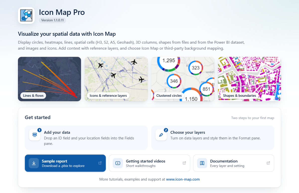
Expected result: the visual shows the Icon Map Pro start page, with a Get started panel. On a large visual the start page also shows example maps. If you have no license, a license message appears once you add fields: select Get FREE Developer License and follow the steps, or enter your license key.
Step 3: Add the fields
Keep the visual selected and drag fields from the Stores table into the field wells in the Build pane, in this order.
Drag City to * ID (required).
Expected result: the start page is replaced by a panel titled What kind of map are you making?. It tells you that only the ID is filled in so far. This panel is the layer guide. It appears whenever your rows do not reach a layer yet.
Drag Longitude to Longitude (X) and Latitude to Latitude (Y).
In each of those two field wells, select the arrow next to the field and choose Average.
Expected result: the layer guide stays, and now says that Circles is turned on, but also needs Circle Size. Point to the Circles tile to see the fields it needs, with a tick next to the ones you have added. The card opens over the tile and, on a short visual, can cover the summary at the top of the guide.
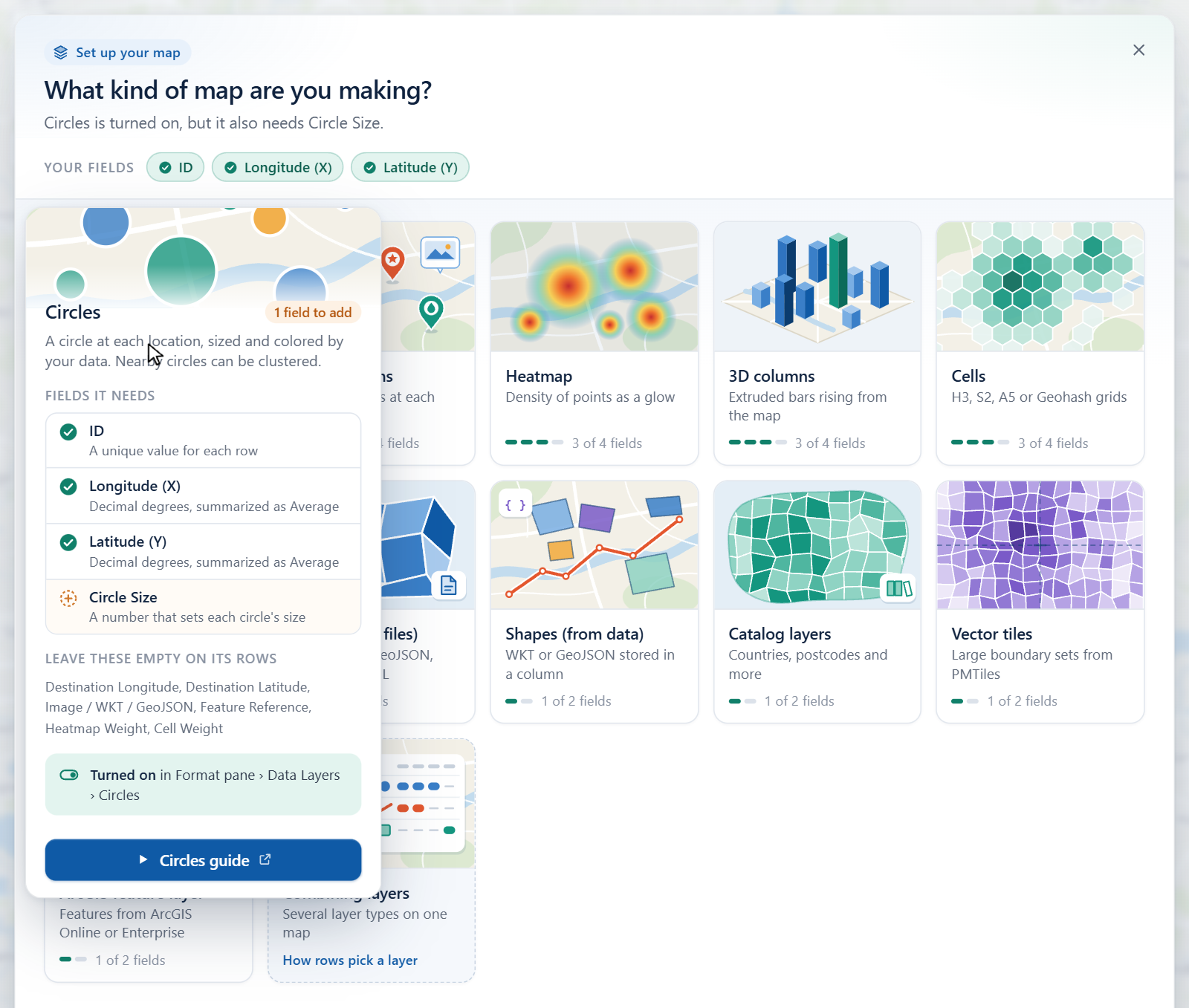
The layer guide shows what each layer type needs Drag Sales to Circle Size.
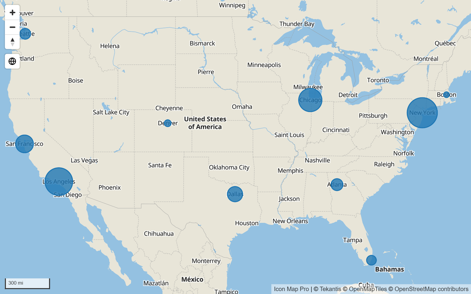
Expected result: the guide closes and the map appears. It zooms to fit ten circles across the United States, larger where sales are higher.
Your field wells now look like this:
| Field well | Field |
|---|---|
| * ID (required) | City |
| Longitude (X) | Average of Longitude |
| Latitude (Y) | Average of Latitude |
| Circle Size | Sum of Sales |
On a new map the Circles layer is already on. Each row has an ID, a longitude, a latitude and a circle size, and no other layer's fields, so it is drawn as a circle. See How Icon Map Pro works.
Step 4: Style the circles in the Layer Manager
Open the Format pane and expand the Layer Manager card, the first card in the list.
Switch on Open Layer Manager. The dialog opens and the switch turns itself off again.
Expected result: the Layer Manager shows On the map on the left with one layer, Circles, above a Basemap row. Under Your data on the right it reports 10 rows and that every row is drawn.
Select the Circles row. Its editor opens on the right.
Drag the handles of Circle size to
8and40. These are the sizes of the smallest and largest circle.Set Outline to white (
#FFFFFF) and Outline width to1.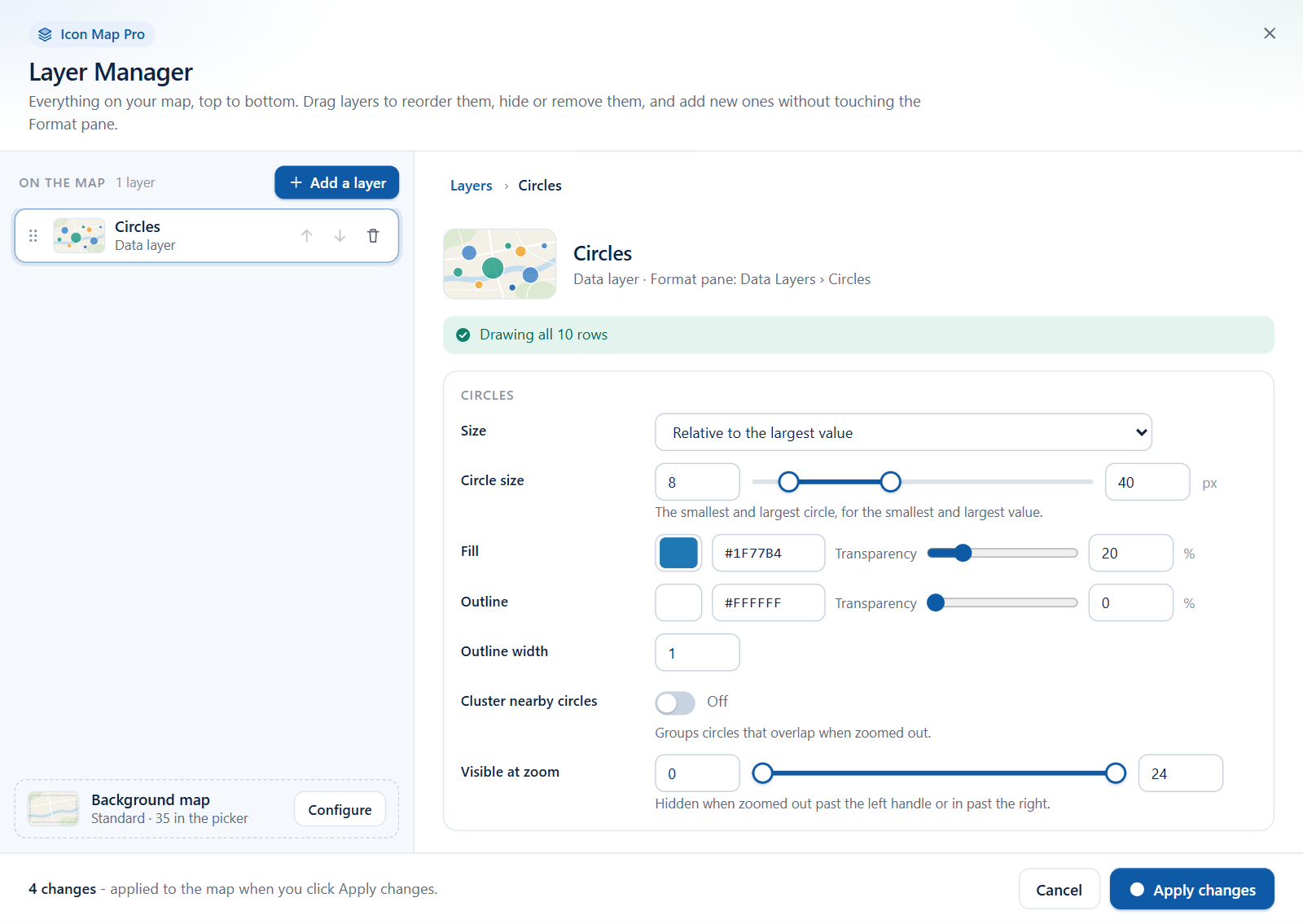
The Circles editor in the Layer Manager Select Apply changes at the bottom right.
Expected result: the dialog closes. The circles now range from small to large with a thin white outline. Nothing is saved to the report until you select Apply changes, so you can use Cancel to back out.
Step 5: Color the circles by sales
The Layer Manager sets one color for a whole layer. To take the color from your data, use conditional formatting in the Format pane.
- In the Format pane, go to Data Layers > Circles - Formatting.
- Next to Fill Color, select the fx button.
- In the Power BI dialog, set Format style to Gradient and choose Sales as the field to base it on. Pick a light color for the lowest value and a dark color for the highest.
- Select OK.
Expected result: each circle takes a color between your two colors. New York, with the highest sales, is the darkest, and Boston the lightest.
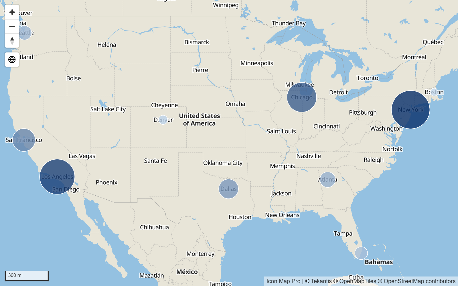
Most color, size and visibility settings accept conditional formatting. See Conditional formatting.
Step 6: Choose a basemap
Open the Layer Manager again (Format pane > Layer Manager > Open Layer Manager).
On the Basemap row at the bottom of the layer list, select Configure.
Expected result: the Layer Manager closes and the Basemaps dialog opens. The list on the left, In the picker, holds the Icon Map basemap styles. The one the map opens with is marked Default.
Find a pale style, for example Positron, and select the star on its row. The Default badge moves to it.
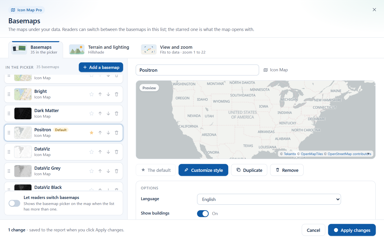
The Basemaps dialog: the starred basemap is the one the map opens with Select Apply changes.
Expected result: the Layer Manager comes back and its footer reads "The basemaps are saved."
Select Done.
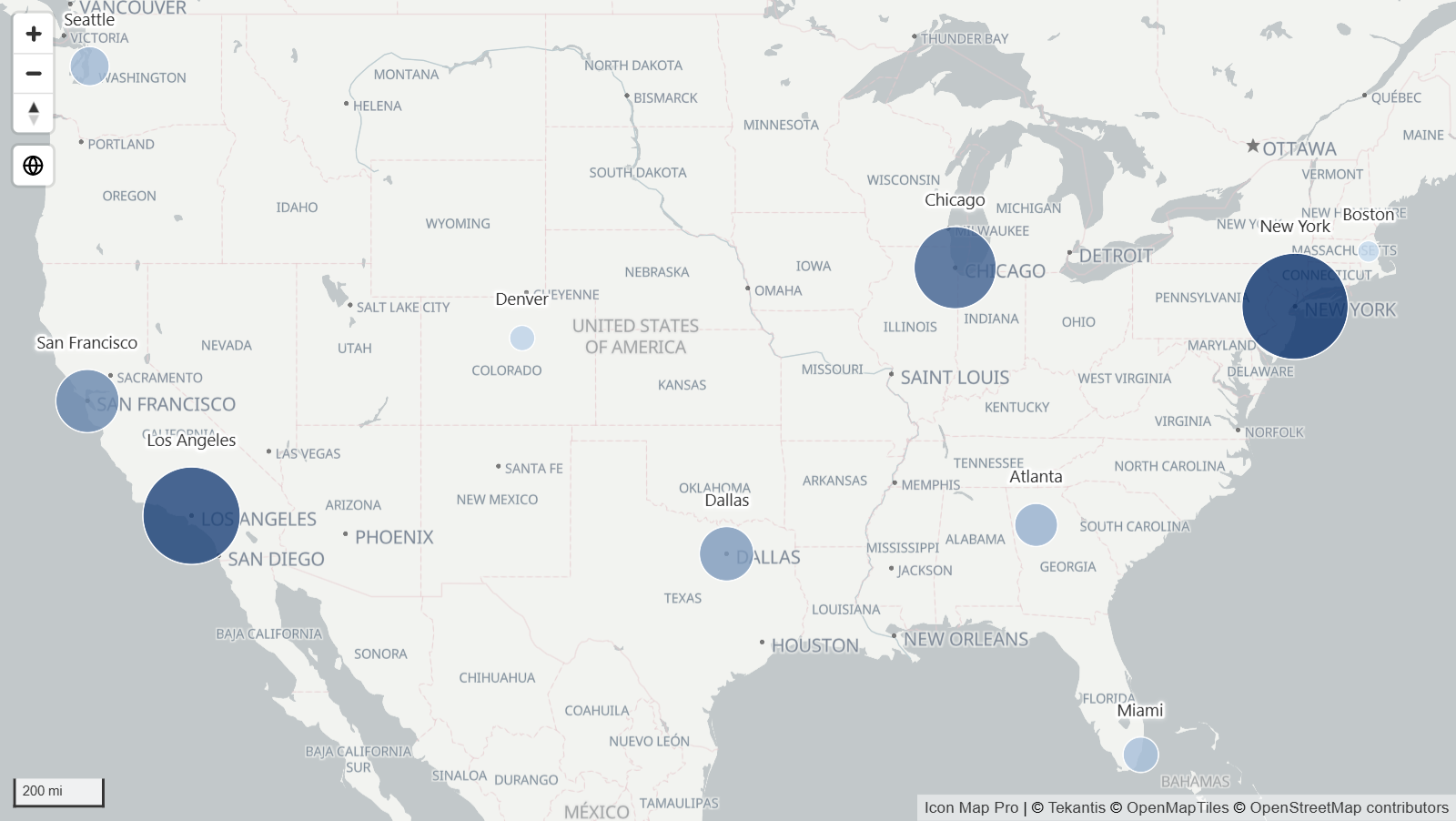
Expected result: the map is now on the pale basemap, and the colored circles stand out against it.
The list of Icon Map styles is updated from time to time, so the names you see can differ from the ones here. Any style works for this tutorial. See Icon Map basemap styles.
Step 7: Add labels
In the Format pane, expand the Labels card and its Content group.
Set Display Label to Yes.
Next to Label Text, select fx. Set Format style to Field value, choose City as the field, and select OK.
Expected result: each circle shows its city name in a box, centered on the circle.
In the Style group, set Label Style to Halo Text.
In the Placement group, set Position (circles & images) to Above.
Expected result: the names sit above the circles as plain text with a white halo, which keeps them readable on any basemap.
Labels now have their own Data labels row in the Layer Manager, where you can change their style, size and color. See Data labels.
Step 8: Add tooltips
- Drag Category to the Tooltips field well.
- Drag Sales to Tooltips as well.
- Point to a circle on the map.
Expected result: a tooltip lists the category and the sales for that city. When the Tooltips field well is empty, the tooltip shows the ID and the circle size instead. See Tooltips.
Step 9: Try it out
- Select a circle. If the page has other visuals, they filter to that city. Select it again to clear the selection. Hold Ctrl to select several.
- Zoom and move. Scroll to zoom, drag to pan, and use the + and - buttons at the top left.
- Switch to a globe. Select the globe button at the top left of the map. Select it again for the flat map.
What you have learned
- A row is drawn when it fills in the fields its layer needs. For circles these are * ID (required), Longitude (X), Latitude (Y) and Circle Size.
- The layer guide tells you what is missing while nothing is drawn.
- The Layer Manager is the place to add, style and order layers, and to open the Basemaps dialog.
- The Format pane is the place for conditional formatting (fx) and for every other setting.