
Images and icons
The Images / Icons layer places a picture at each longitude and latitude. The picture can come from your data, from one image link, from the built-in icon library, or it can be a short piece of text or an emoji drawn as a badge.
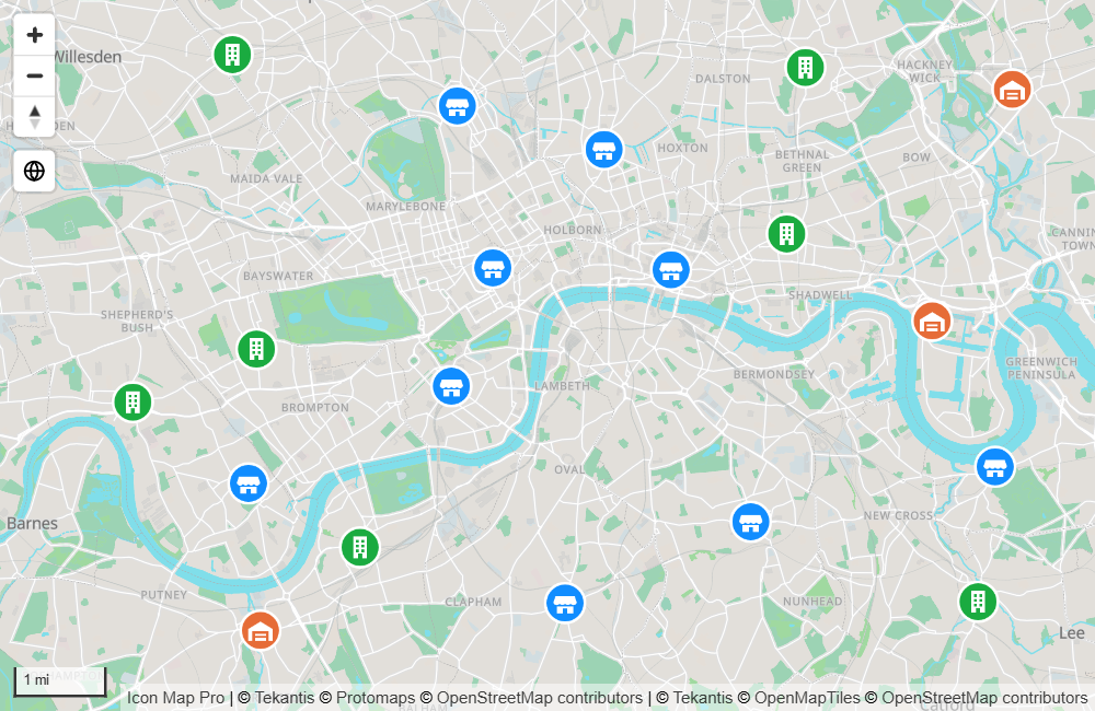
What you need
| Field well | What to put in it |
|---|---|
| * ID (required) | A unique value for each row |
| Longitude (X) | Longitude in decimal degrees, summarized as Average |
| Latitude (Y) | Latitude in decimal degrees, summarized as Average |
| Image / WKT / GeoJSON | The image for each row. Not needed when the image source is the icon library or one link for every point. |
These fields must be empty on an image's rows: Circle Size, Destination Longitude, Destination Latitude, Feature Reference, Heatmap Weight and Cell (H3/S2/A5/Geohash) Weight.
A row with a value in Circle Size is a circle, not an image. If you started with circles, take the field out of Circle Size or the images will not appear.
Add images to the map
- Add fields to * ID (required), Longitude (X) and Latitude (Y). Set the coordinates to Average.
- If your data holds an image for each row, add that field to Image / WKT / GeoJSON.
- If the panel What kind of map are you making? is showing, select the Images & icons tile. It turns the layer on and opens the Layer Manager on it. Otherwise, in the Format pane expand Layer Manager, switch on Open Layer Manager, and select Add a layer, Data layer, Images & icons.
- Under Images come from, choose where the pictures come from, and set the Width and Height.
- If you are adding the layer, select Add to map. Then select Apply changes.
The Layer Manager offers these settings. To change them later, open the Layer Manager and select the Images & icons row.
| Layer Manager setting | Same as, in the Format pane |
|---|---|
| Images come from | Image Source |
| Image link | Image URL |
| Icon name | Icon Name / Text |
| Width, Height | Image Width, Image Height |
| Icon color | Icon / Background Color |
| Transparency | Transparency |
| Cluster nearby images | Cluster Images |
| Visible at zoom | Minimum Zoom and Maximum Zoom |
The icon library browser, rotation, offsets and conditional formatting (fx) are in Format pane > Data Layers > Images - Configuration, and the other cluster settings in Cluster - Configuration.
Where the image comes from
Image Source has three options.
URL from data
Each row carries its own image in the Image / WKT / GeoJSON field. The value can be:
| Value | Example |
|---|---|
A link starting with https:// |
https://example.com/icons/store.png |
| A data URI | data:image/png;base64,... |
| SVG text | <svg xmlns="http://www.w3.org/2000/svg" ...>...</svg> |
The word pin |
Draws a built-in map pin |
Links must use https://. A link starting with http:// is not treated as an image. The server that hosts the images must allow them to be read from other sites (CORS), otherwise they cannot be drawn. Data URIs and SVG text are held in your data, so they need no server.
Custom URL
One image link for every point, entered in Image URL. Rows need nothing in the Image / WKT / GeoJSON field. Image URL has an fx button, so a measure or rule can still choose a different link per row.
Icon Library
Icons from the built-in library of Material Design icons, in five styles, each on its own tab: Filled, Outlined, Round, Sharp and Two tone.
- Set Image Source to Icon Library.
- Switch on Show Icon Library. A dialog opens.
- Choose a style tab, type in the Search box and select an icon. The dialog shows the first 200 matches, so refine the search if you do not see the icon you want.
- Select OK. The icon's name is written to Icon Name / Text.
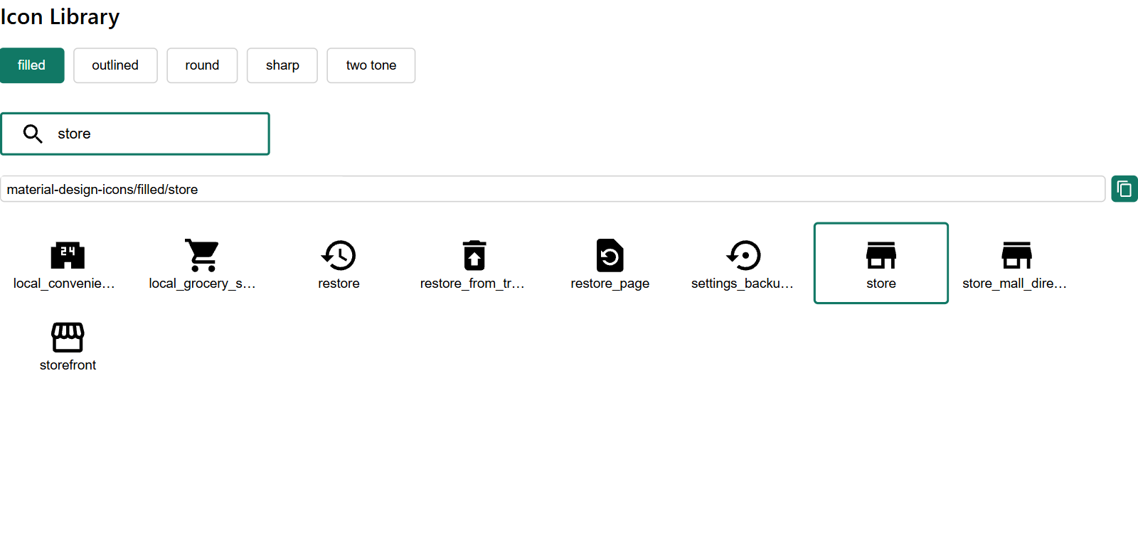
An icon name looks like material-design-icons/filled/home. Because Icon Name / Text has an fx button, you can hold icon names in a column or return them from a measure, and show a different icon for each row. Set the icon's color with Icon / Background Color, which also takes fx. A library icon is square: Image Width sets both its width and height.
Text and emoji badges
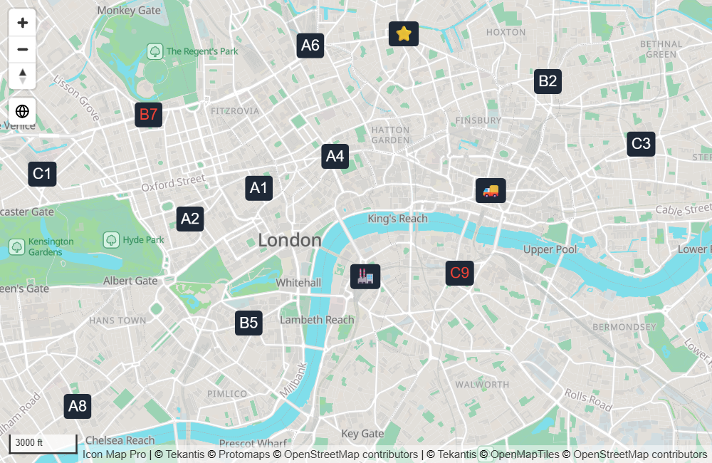
With Image Source set to Icon Library, any value in Icon Name / Text that is not a library icon name is drawn as text on a rounded badge. Emoji work too.
- The badge is as tall as Image Width and as wide as the text needs.
- Icon / Background Color and Icon Background Transparency set the badge.
- Icon Text Color sets the text.
You can also set the text color in the value itself with a prefix:
| Value | Result |
|---|---|
Hello or text:Hello |
"Hello" in the Icon Text Color |
text-red:Hello |
"Hello" in red |
text-#884455:Hello |
"Hello" in the color #884455 |
The named colors are white, black, red, amber, orange, yellow, green, blue and gray.
Settings
All of these are in Format pane > Data Layers > Images - Configuration, shown when the Images / Icons switch is on.
| Setting | What it does | Default | fx |
|---|---|---|---|
| Image Source | URL from data, Custom URL or Icon Library. See above. | URL from data | |
| Image URL | The image link for every point. Shown for Custom URL. | Empty | Yes |
| Icon Name / Text | A library icon name, or text for a badge. Shown for Icon Library. | Empty | Yes |
| Show Icon Library | Opens the icon browser, then switches itself off. Shown for Icon Library. | Off | |
| Use Cluster Color | With Cluster Images on and a field in Cluster Group, each icon takes the color of its cluster group. Shown for Icon Library. | Off | |
| Icon Text Color | Text color of a badge. Shown for Icon Library. | #FFFFFF | Yes |
| Icon / Background Color | Color of a library icon, or background of a badge. Shown for Icon Library. | #000000 | Yes |
| Icon Background Transparency | Transparency of a badge's background. Shown for Icon Library. | 0 | Yes |
| Image Rotation | Rotates the image clockwise, in degrees, 0 to 360. Use fx to point each image in its own direction, for example a vehicle heading. | 0 | Yes |
| Rotation Alignment | Viewport keeps images fixed to the screen when the map rotates. Map rotates them with the map. | Viewport | |
| Pitch Alignment | Viewport keeps images upright when the map is tilted. Map lays them flat on the map. | Viewport | |
| Image Width | Width in pixels. 0 to 1000. | 30 | Yes |
| Image Height | Height in pixels. 0 to 1000. Not shown for Icon Library. | 30 | Yes |
| Transparency | 0 is solid, 100 is invisible. | 0 | Yes |
| Cluster Images | Groups nearby images into clusters. See Clusters. | Off | |
| Offset Overlapping Images | Images at the same location are laid out side by side instead of on top of each other. | Off | |
| Offset Gap (pixels) | Space between images that have been offset. 0 to 100. | 2 | |
| Offset Tolerance (meters) | How close images must be to count as the same location. 0 means exactly the same coordinates. Up to 10000. | 0 | |
| Include in Auto Zoom | Whether an image counts toward the area the map zooms to. | Yes | Yes |
| Include Tooltip | Whether an image shows a tooltip. | Yes | Yes |
| Selectable | Whether an image can be selected. | Yes | Yes |
| Minimum Zoom | Images are hidden when the map is zoomed out past this level. | 0 | |
| Maximum Zoom | Images are hidden when the map is zoomed in past this level. | 24 | |
| Z Index | Drawing order among the layers. Higher draws on top. 0 to 1000. | 410 | |
| EPSG | Coordinate system of your longitude and latitude. | 4326 |
Offset overlapping images
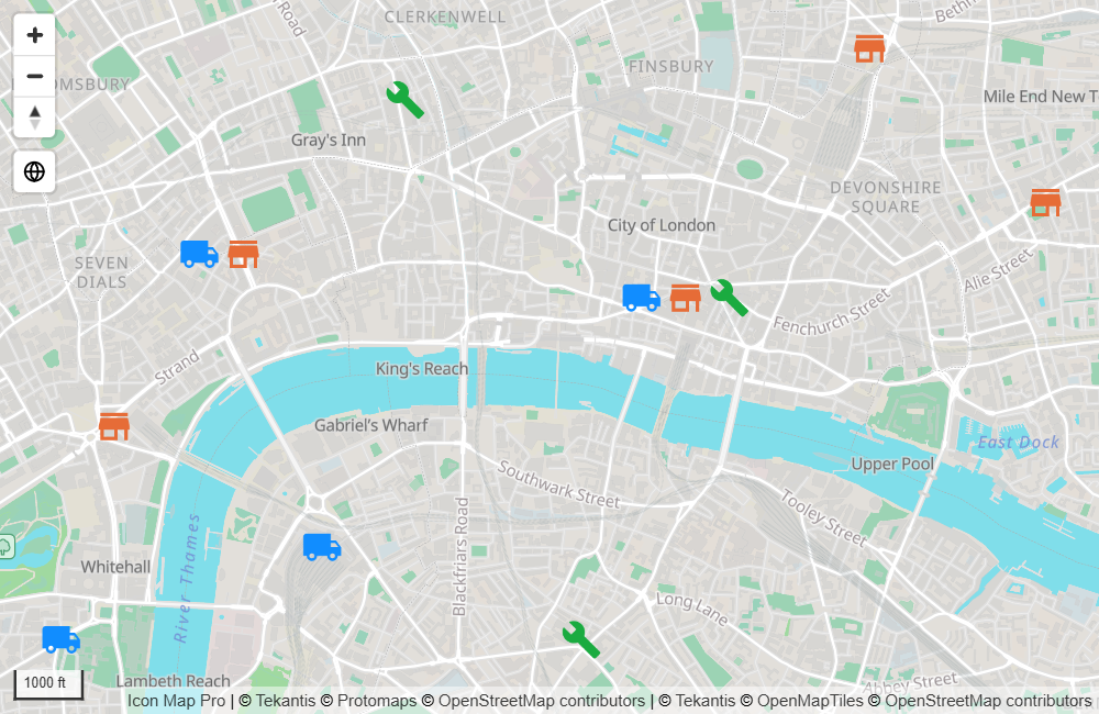
When several rows share a location, for example three assets at one site, their images sit exactly on top of each other. Turn on Offset Overlapping Images to lay them out in a horizontal row centered on the location, Offset Gap (pixels) apart. Raise Offset Tolerance (meters) to treat images within that distance as being at the same place. Offsets apply to images that are not in a cluster.
Selection, tooltips and labels
- Selection. Select an image to cross-filter or cross-highlight the report page. Images you did not select fade, using the transparency values in the Interactivity card. See Selection, cross-filtering and highlighting.
- Tooltips. With no fields in Tooltips, the tooltip shows the ID. Add fields to Tooltips to show those instead. See Tooltips.
- Labels. Images can carry data labels at the center, above, below, left or right of the image. See Data labels.
- Legend. Images appear in the legend as Icons. See Legend.
Tips and limits
- An image is anchored at its center. For a pin whose tip should touch the location, use an image with empty space below the tip so that the tip is at the center.
- Images never hide each other. Where they overlap, all of them are drawn.
- Images have their own position in the drawing order, set by the Images Z Index. The default, 410, draws them above Lines (409) and Circles (405). Their data labels stay with the other data labels, above the images.
- For images hosted on a web server, check that every link opens over
https://and that the server allows cross-origin requests. - Text badges and SVG values that repeat are drawn once and reused, so a few distinct values across many rows stay fast. Thousands of different remote images are slower: prefer small files, or library icons colored with fx.
- If your network blocks external sites, library icons can be served from your own server. See Power BI Report Server (on-premises).