Data labels
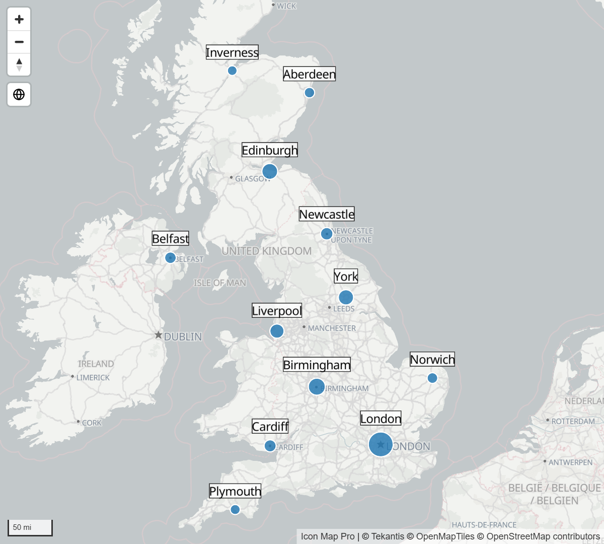
Data labels write text from your report beside the circles, images, lines and shapes on the map. Use them to name places, show a value without a tooltip, or build a small card with a title, picture and footer for each item.
Before you start
- Labels are set in the Labels card of the Format pane. The card appears when at least one layer that can carry labels is switched on: Circles, Images / Icons, Shapes (from data), Shapes (from files), Vector Tiles, Lines or Cells.
- The text of a label normally comes from a field or a measure, set with conditional formatting (fx). See Conditional formatting.
Add labels to a map
- In the Format pane, open Labels > Content and set Display Label to Yes.
- Next to Label Text, select fx, choose Field value, and pick the field or measure that holds the text for each row.
- Open Labels > Style and choose a Label Style. Classic draws plain map text; the other styles draw each label as a card.
- Open Labels > Placement and choose a Position (for circles and images) so the label does not cover its item.
A row draws a label only when it has text. Typing text straight into Label Text gives every item the same label, so use fx for per-row text.
Display Label takes conditional formatting. Give it a measure that returns yes or no to label only the rows that matter, for example the top ten by sales.
Which layers can carry labels
| Layer | Data labels | Notes |
|---|---|---|
| Circles | Yes | Placed with Position (circles & images). |
| Images and icons | Yes | Placed with Position (circles & images). |
| Clusters | No | Points inside a cluster are not labeled. The cluster shows its own total. |
| Lines | Yes | At the middle of the line. Flow and Smoothed Flow have Data Label At Destination. Flow Arcs and Flow Tree have Label Position (None, midpoint or Destination). |
| Routes | Yes | At the middle of each link. |
| Shapes from data | Yes | Every shape can carry a label. |
| Shapes from files | Yes | Shapes matched to a row take that row's label, at every level. |
| Vector tiles | Yes | At every level. |
| Cells | Optional | Switch on Show data labels in the Cells settings as well. Cells aggregated from points are labeled with the cell's value. Not available for Custom shapes read from a PMTiles file. |
| Heatmap | No | |
| 3D columns | No | |
| ArcGIS layers bound to data | No | Not labeled from the Labels card. |
| Icon Map Catalog layers | No | Catalog layers have their own labels, set in the catalog window. |
Reference layers have their own label settings, separate from the Labels card. See Labels on reference layers.
Label styles
Format pane > Labels > Style > Label Style sets how every data label is drawn. Classic draws plain map text. The other five styles draw each label as a card, typeset with the font you choose, and unlock the card content described in Card content and layout.
Classic
Plain map text, with an optional box behind it (Display Container). This is the default. It uses the map's own fonts: Noto Sans, Open Sans, Roboto, PT Sans or Metropolis, with Bold and Italic switches.
To put a smaller second line under the first, type \n in the text where the line should break, for example Leeds\n1,240 orders.
Halo Text
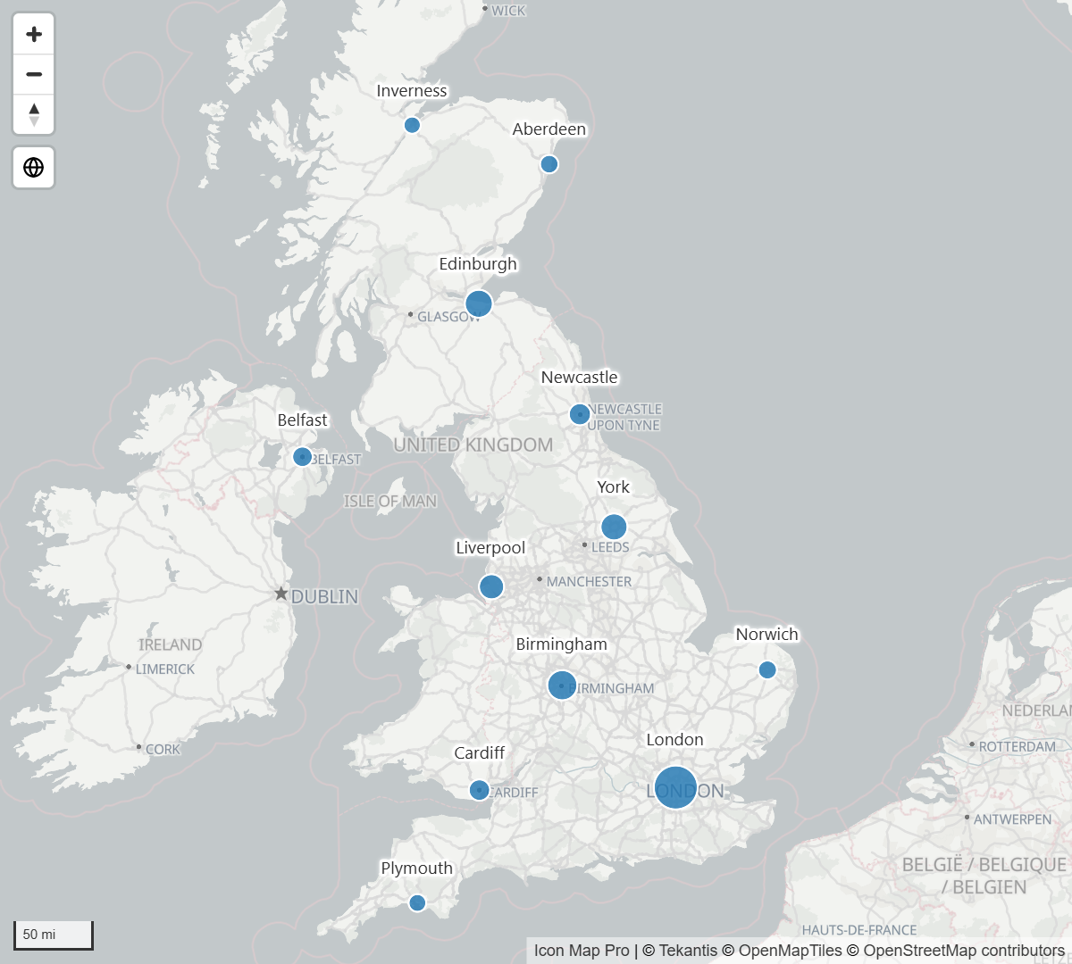
Text with a colored halo around the letters and no box. It stays readable over busy basemaps and imagery. Set the Halo Color and its Transparency in the Halo group.
Glass
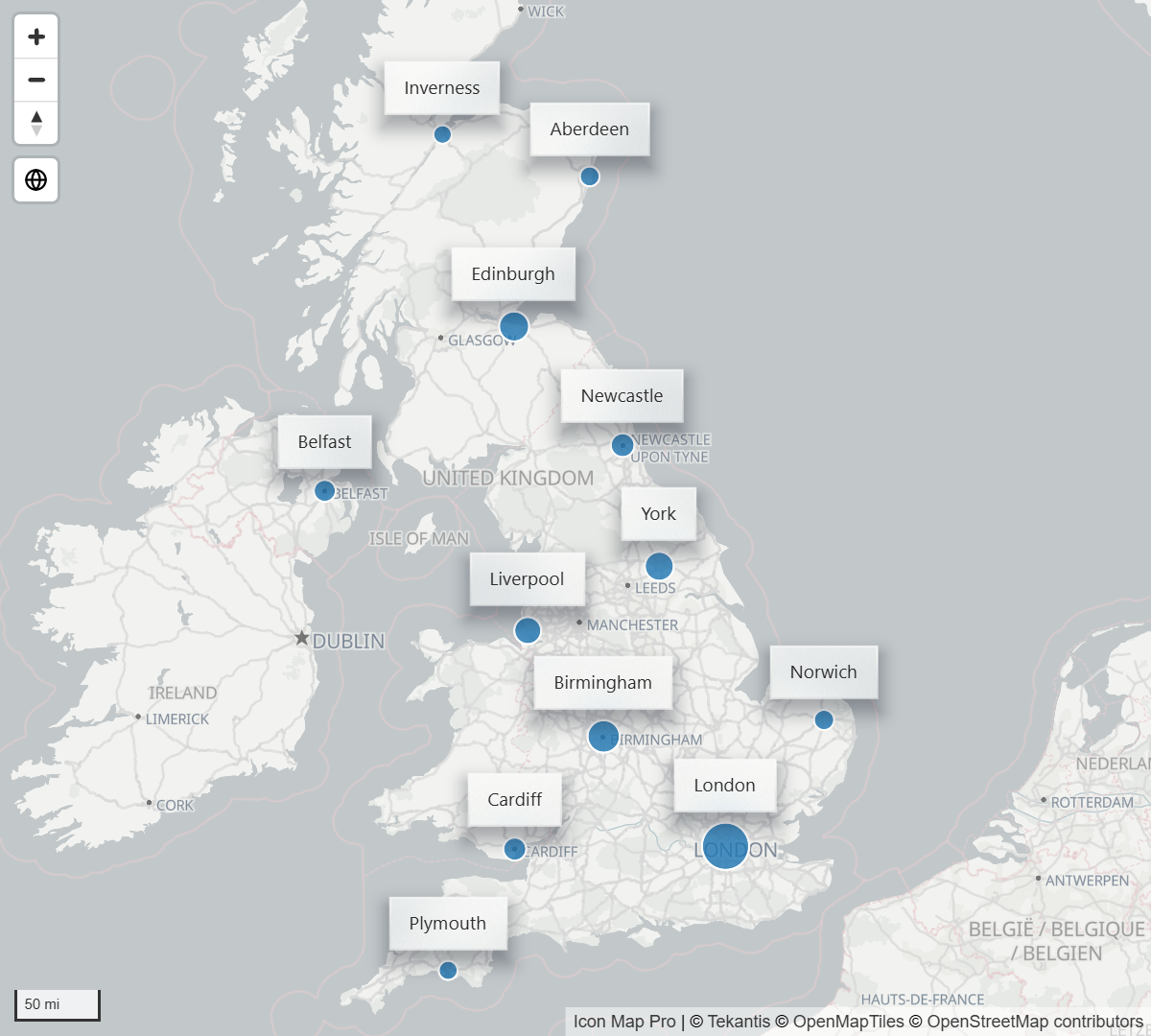
A light card that blurs the map behind it. Set a Tint Color, and choose between a Frosted and a Solid fill Background. Frost (%) sets how strongly the map is blurred.
Dark Glass
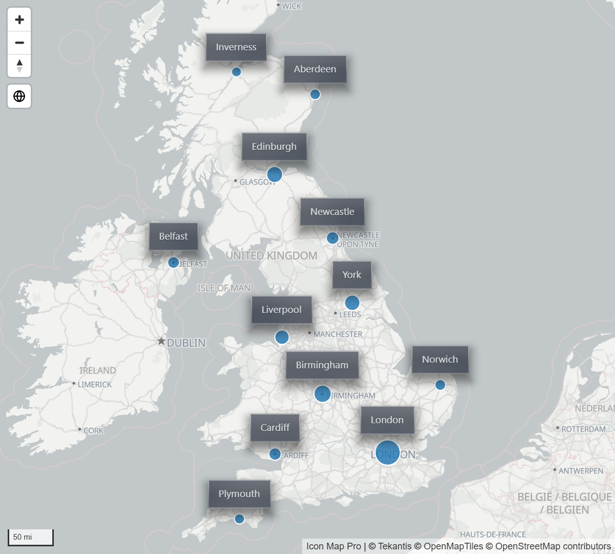
The dark version of Glass. If you leave Text Color at its default black, the text is drawn light so it can be read on the dark card.
Card
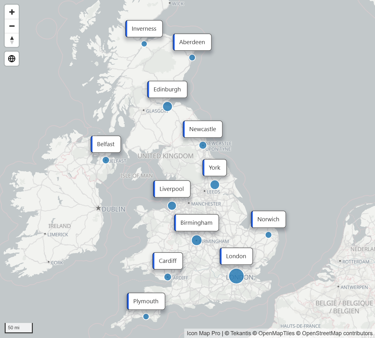
A solid card with its own Fill Color, Border Color and Border Width, and a stripe in the Accent Color.
Neon
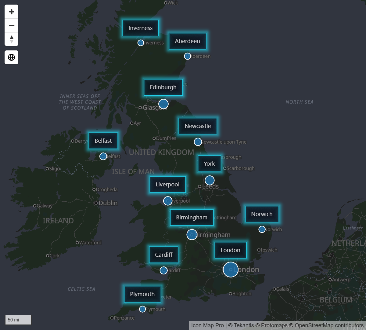
A card with a glow in the Accent Color. It suits dark basemaps.
Card content and layout
With any style other than Classic, a label can hold more than one line of text. Each part is a setting in Labels > Content, and each takes fx so it can come from a field.
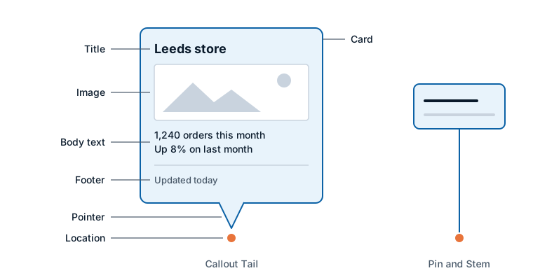
| Part | Setting | What it is |
|---|---|---|
| Title | Title Text | Drawn bold above the body. Uppercase Title writes it in capitals. |
| Image | Image | A picture shown with the body text: an https address, a data URL or SVG markup. |
| Body | Body Text | The main text. This is the same setting as Label Text in the Classic style. |
| Footer | Footer Text | Drawn smallest, at the foot of the card, under a fine rule. |
| Card | Card group | The box around the text: color, transparency, border, corner radius and margins. |
| Pointer | Pointer | A callout tail, or a pin and stem, joining the card to its location. |
A label with a title and no body text still draws: the title is used as the text.
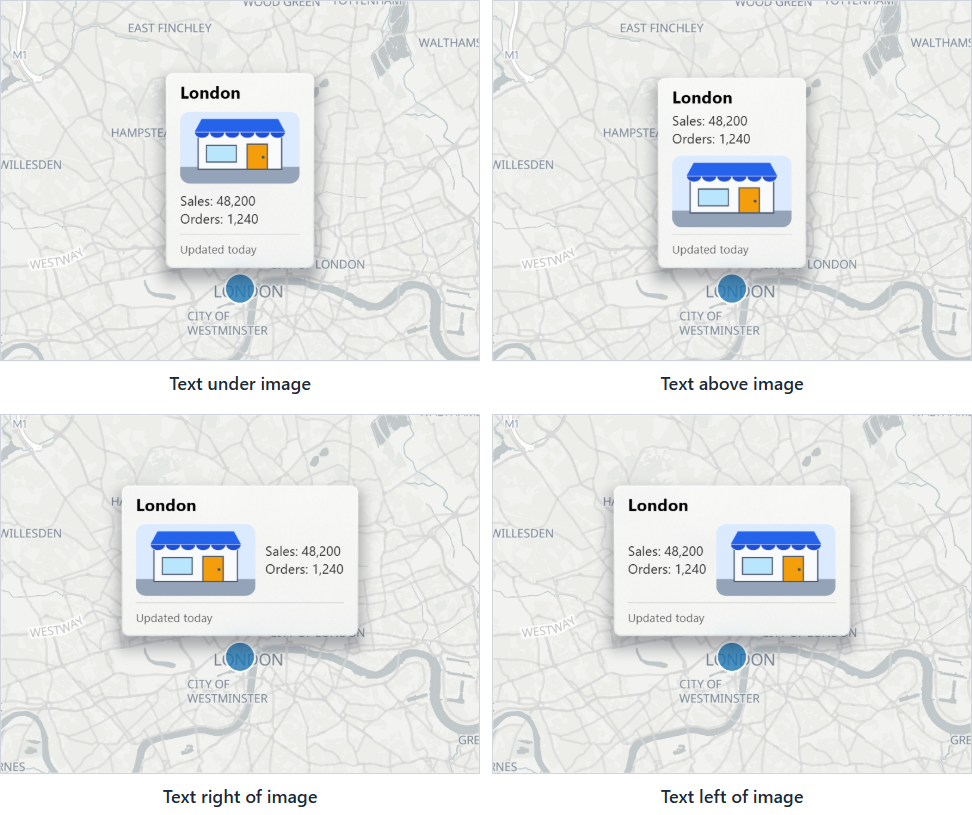
Body Layout sets where the body text sits when a label has an image: Text under image, Text above image, Text right of image or Text left of image. When the text sits beside the image, Vertical Alignment sets how the shorter of the two lines up against the taller. A card that is too narrow for text beside the image stacks them instead.
Max Width (px) in Size and Zoom sets how wide a card can grow before its text wraps onto another line.
An image given as an https address is only drawn when the server that hosts it allows other websites to read it. If an image does not appear, host it somewhere that allows this or use a data URL.
Label Visibility
Labels > Content > Label Visibility decides when labels are on the map.
| Option | What it shows |
|---|---|
| Always | Every label. This is the default. |
| On mouse over | Only the label of the item under the mouse pointer, like a tooltip. With a card style the label stays up while the pointer is on the card itself. |
| When selected | Only the labels of selected items, and of items highlighted by another visual. |
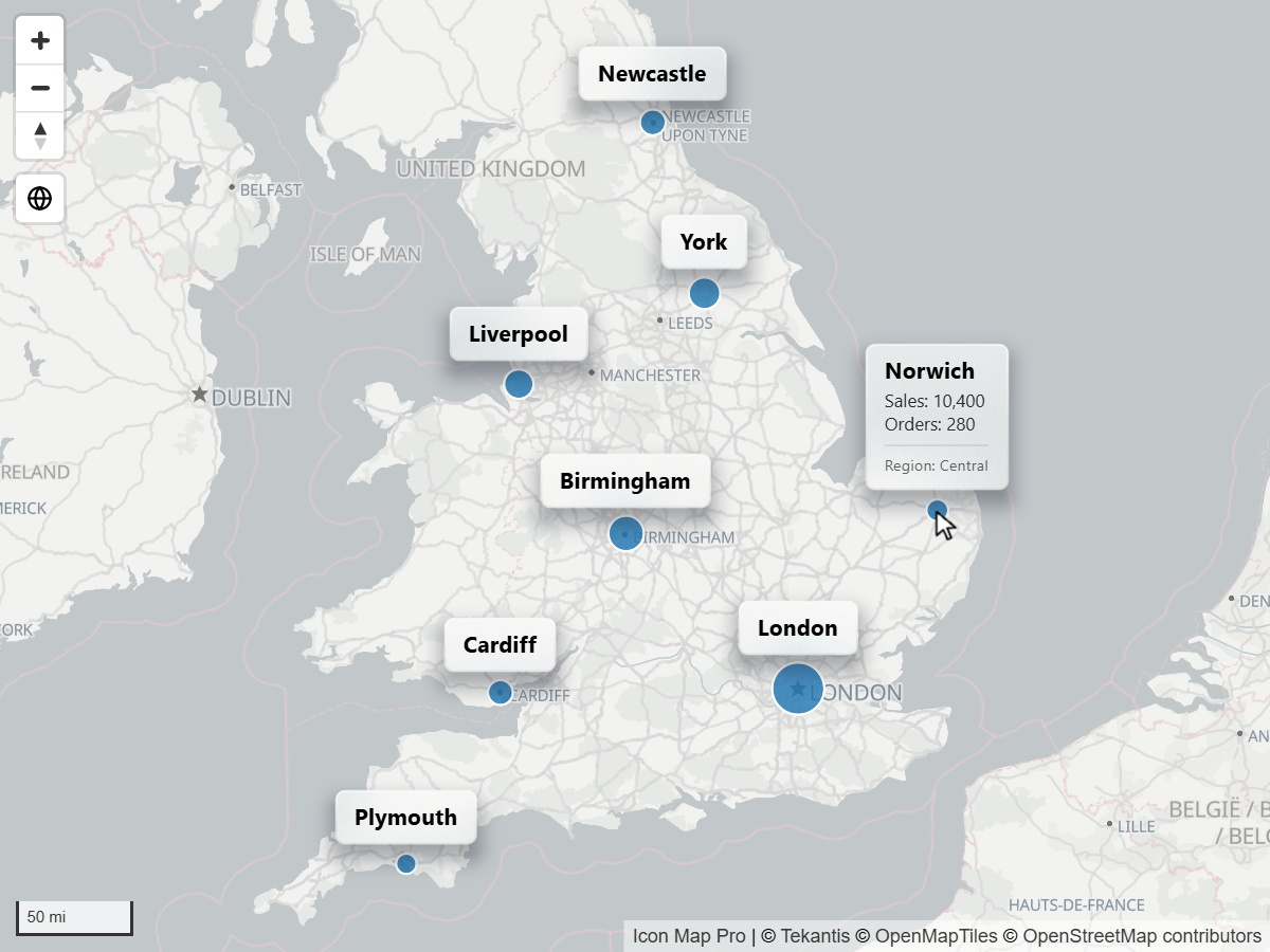
With a card style and On mouse over or When selected, the extra switch Always Show Title keeps the title of every label on the map and shows the rest of the card on demand.
Placement
- Position (circles & images) puts the label Above, Below, Left, Right or at the Center of its circle or image. It takes fx, so each row can have its own position.
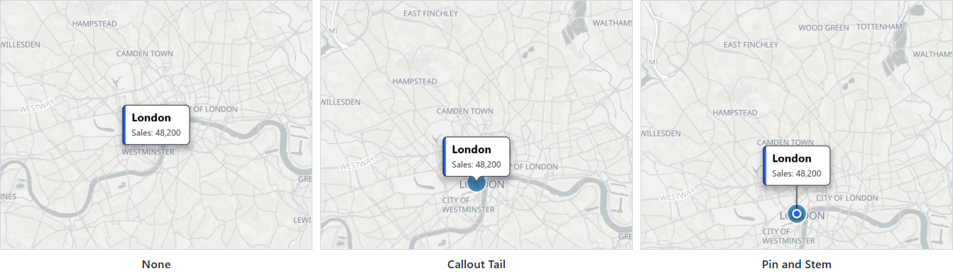
- Pointer (card styles except Halo Text) joins a card to its location. Callout Tail draws a tail pointing back at the location, and Position then chooses which side the card sits on. Pin and Stem raises the card above the location on a line; Stem Height (px) sets how far.
- Orientation (card styles) matters when the map is tilted. Upright (faces the viewer) stands labels up like signs. Flat (lies on the map) lays them on the ground in perspective.
- Label Height (card styles) is for labels on 3D shapes, such as a room on an upper floor: the label can sit at the Top of Shape, the Base of Shape or on the Ground.
- Keep Labels Inside Shapes places each polygon's label at the point deepest inside the shape, so labels on irregular shapes stay inside them.
- Avoid Overlapping hides labels that would collide with another label.
Settings
All settings are in the Labels card of the Format pane. "Card styles" means every Label Style except Classic.
Content
| Setting | What it does | Default |
|---|---|---|
| Display Label | Yes or No. Switches labels on. Takes fx, per row. | No |
| Label Visibility | Always, On mouse over or When selected. | Always |
| Always Show Title | Keeps every title on the map when the rest of the label shows on demand. Card styles, with On mouse over or When selected. | Off |
| Label Text | The text of the label. Named Body Text in card styles. Takes fx. | Empty |
| Title Text | Bold title above the body. Card styles. Takes fx. | Empty |
| Title Alignment | Left, Center or Right. Card styles. | Left |
| Uppercase Title | Writes the title in capitals. Card styles. | Off |
| Image | A picture shown with the body text. Card styles. Takes fx. | Empty |
| Image Height (px) | Height of the image, 8 to 600, at the largest font size. A wide image is narrowed to fit Max Width (px). | 96 |
| Body Layout | Where the body text sits against the image. Card styles. | Text under image |
| Vertical Alignment | Top, Middle or Bottom, when the text is beside the image. | Middle |
| Body Alignment | Left, Center or Right. The image takes the same alignment. Card styles. | Left |
| Footer Text | Small text at the foot of the card. Card styles. Takes fx. | Empty |
| Footer Alignment | Left, Center or Right. Card styles. | Left |
Style
| Setting | What it does | Default |
|---|---|---|
| Label Style | Classic, Glass, Dark Glass, Card, Neon or Halo Text. | Classic |
| Font Family | Classic: one of the map's fonts (Noto Sans, Open Sans, Roboto, PT Sans, Metropolis). Card styles: any font. | Classic draws in Noto Sans; card styles in Segoe UI |
| Bold, Italic | Classic only. | Off |
| Text Color | Color of the text. Takes fx. | #000000 |
| Accent Color | The stripe on a Card, the glow of Neon, and the pin at the foot of a stem. | #2563EB |
| Background | Frosted blurs the map behind the label. Solid fill draws the fill without the blur. Glass, Dark Glass and Neon. | Frosted |
| Frost (%) | How strongly the map behind the label is blurred. 0 turns the blur off. | 60 |
Container, Card or Halo
This group is named Container for Classic, Card for Glass, Dark Glass, Card and Neon, and Halo for Halo Text. The settings it offers depend on the style.
| Setting | What it does | Default | Styles |
|---|---|---|---|
| Display Container | Yes or No. Draws the box behind the text. Takes fx. | Yes | Classic |
| Fill Color | Color of the box. Named Tint Color for Glass and Halo Color for Halo Text. Takes fx. | #FFFFFF | Classic, Card, Glass, Halo Text |
| Transparency | 0 to 100. Takes fx. | 20 | All |
| Border Color | Takes fx. | #000000 | Classic, Card |
| Border Width | 0 to 20. Takes fx. | 1 | Classic, Card |
| Border Radius | 0 to 90. 0 gives square corners. Takes fx. | 0 | All except Halo Text |
| Margins | Space between the text and each edge of the box. | 0 | All except Halo Text |
Placement
| Setting | What it does | Default |
|---|---|---|
| Orientation | Upright (faces the viewer) or Flat (lies on the map). Card styles. Only visible when the map is tilted. | Upright |
| Pointer | None, Callout Tail or Pin and Stem. Card styles except Halo Text. Pin and Stem is not offered for flat labels. | None |
| Stem Height (px) | 0 to 300. With Pin and Stem. | 36 |
| Label Height | Top of Shape, Base of Shape or Ground, for labels on 3D shapes. Card styles. | Top of Shape |
| Position (circles & images) | Above, Below, Left, Right or Center. Shown when Pointer is None. Takes fx. | Center |
| Position | Above, Below, Left or Right: the side of its location each card sits on. Shown when Pointer is Callout Tail. Takes fx. | Above |
| Keep Labels Inside Shapes | Places each polygon label at the point deepest inside its shape. | Off |
| Avoid Overlapping | Hides labels that would collide. | Off |
Size and Zoom
| Setting | What it does | Default |
|---|---|---|
| Font Size (min zoom) | Text size, 0 to 100, at Font Min Zoom and below. Sizes of 12 or more stay sharp. | 16 |
| Font Min Zoom | 0 to 24. | 5 |
| Font Size (max zoom) | Text size at Font Max Zoom and above. | 16 |
| Font Max Zoom | 0 to 24. | 10 |
| Max Width (px) | 60 to 800. Longer text wraps onto more lines. Card styles. | 220 |
| Visible From Zoom | Labels are hidden when the map is zoomed out past this level. | 0 |
| Visible To Zoom | Labels are hidden when the map is zoomed in past this level. | 24 |
| Z-Index | Where labels sit in the drawing order. Higher draws on top. | 950 |
Between Font Min Zoom and Font Max Zoom the text size changes smoothly from one size to the other. Set the two sizes differently to make labels grow as readers zoom in.
Tips and limits
- Labels dim with their items when a selection is active. To keep labels at full strength, switch off Format pane > Interactivity > Item selection > Include Labels. See Selection, cross-filtering and highlighting.
- Avoid Overlapping also works with On mouse over and When selected: hidden labels take no room.
- A report saved with the earlier Pill style draws its labels as Glass.
- Label styles are drawn as designed in Windows high contrast mode; they do not switch to the high contrast colors.
- The Text, Alignment and Container layout of this card belongs to the Legacy engine. See the documentation for 1.1.0.9 and earlier.