
How Icon Map Pro works
Every Icon Map Pro map is built from three parts: a basemap, data layers that draw the rows of your report, and reference layers that add context. Once you know how a row of data finds its layer, the rest of the visual falls into place.
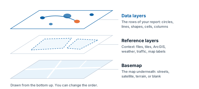
The three parts of a map
| Part | What it is | Where it comes from |
|---|---|---|
| Basemap | The map underneath everything: streets, satellite imagery, a light or dark canvas, or a plain color. | Icon Map's own styles, or a provider such as ArcGIS, Azure Maps or Ordnance Survey. See Basemaps overview. |
| Data layers | Your report data, drawn on the map. Each row of data becomes one thing on the map: a circle, an image, a line, a shape, a 3D column, or a point counted into a heatmap or cell. | The fields you add to the visual. See Data layers overview. |
| Reference layers | Context that is drawn as published and is not joined to your data: boundaries from a file, imagery, an ArcGIS layer, weather, traffic, place names over your data. | A link, an uploaded file or a service. See Reference layers overview. |
Data layers respond to the report. They cross-filter other visuals, show tooltips and follow slicers. Reference layers do not change with your data.
Layers are drawn from the bottom up, and each layer has a position in that order. You can change it, for example to draw a boundary file above your circles or place names above everything.
Fields: how data reaches the map
You give Icon Map Pro data by adding fields to its field wells in the Build pane, as with any Power BI visual. The field wells are:
| Field well | Used for |
|---|---|
| * ID (required) | A value that identifies each row. Every layer needs it. |
| Longitude (X), Latitude (Y) | Where a point is, or where a line starts. |
| Destination Longitude, Destination Latitude | Where a line ends. |
| Circle Size | The size of each circle. |
| Cluster Group | The category used to split clusters of circles or images. |
| Heatmap Weight | How much each point adds to a heatmap. |
| Cell (H3/S2/A5/Geohash) Weight | The value added up in each cell. |
| Column Height | The height of each 3D column. |
| Image / WKT / GeoJSON | An image address for the Images layer, or shape geometry as text for Shapes (from data). |
| Feature Reference | The code or name that joins a row to a shape in a file, a tile set, an ArcGIS layer or a catalog layer. |
| Feature Weight | A value that colors a joined shape when conditional formatting is not used. |
| Daylight Date & Time | The time shown by the daylight reference layer. |
| Tooltips | The fields listed in the tooltip. |
The Fields reference describes each one in full.
One row is one thing on the map
Power BI groups your data by the field in * ID (required) and sends Icon Map Pro one row for each ID value. Each row becomes one item on the map. Two consequences follow:
- The ID must be unique for each thing you want to draw. If two stores share an ID, they become one row and one circle.
- Without an ID, Power BI sends no rows and nothing can be drawn.
Because the other field wells hold summarized values, set Longitude (X) and Latitude (Y) to Average (select the arrow next to the field in the Build pane). With a unique ID, the average of one row is the row's own value.
By default Power BI sends up to 30,000 rows. You can raise this. See Data rows and limits.
A row picks its layer by the fields it fills in
There is no setting that says "draw this row as a circle". Instead, each row is drawn by the layer whose fields it fills in, as long as it leaves the fields that belong to other layers empty.
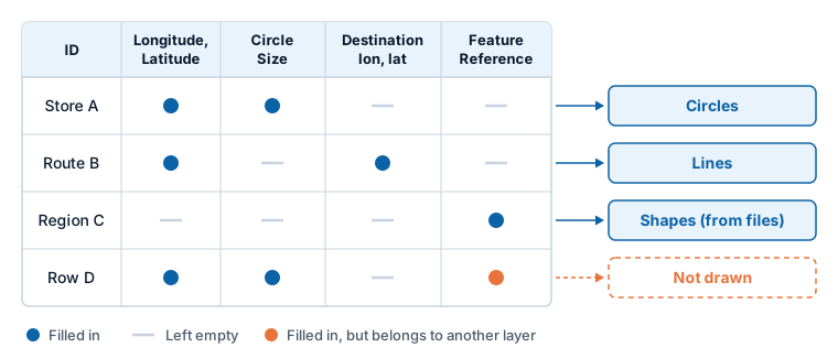
In the example:
- Store A has a longitude, a latitude and a circle size, and nothing else. It is a circle.
- Route B has an origin and a destination. It is a line.
- Region C has only a feature reference. It is joined to a shape in a file.
- Row D fills in the fields of a circle and also a feature reference. Circles skip it, because a feature reference marks a row as a shape. Shapes (from files) skip it, because it has coordinates. It is not drawn.
Three rules cover most cases:
- Fill in what the layer needs. A circle needs * ID (required), Longitude (X), Latitude (Y) and Circle Size. A line needs the two destination fields instead of a size. Choose a layer type lists the fields for every layer.
- Leave the other layers' fields empty on that row. Empty means the field is not in the visual, or the row's value is blank. A blank text cell counts as empty, the same as a
BLANK()returned by a measure. - Turn the layer on. A row is only drawn if its layer is switched on. On a new map, Circles is on and the other data layers are off.
This is also how one map shows several layer types at once: keep the rows in one table and fill in different fields on different rows. Combine several layers in one map explains the patterns.
While you edit a report, Icon Map Pro tells you when your rows do not reach any layer. A panel titled What kind of map are you making? appears over the map and shows which fields each layer type needs and which you already have. See Choose a layer type.
Where the settings are
All settings are in the Format pane. Each part of the map has its own card:
| Card | What it holds |
|---|---|
| Background Layer | The basemap, plus hillshade, 3D terrain, light and sky. |
| Reference Layers | Switches and settings for each reference layer. |
| Catalog (Preview) | Layers from the Icon Map Catalog. |
| Data Layers | A switch for each data layer, then its configuration and formatting. |
| Labels, Legend | Data labels and the legend. |
| Controls, Map, Interactivity | The buttons on the map, zoom and view, and selection behavior. |
See Format pane map for the full list.
Values from your data: conditional formatting
Many settings have an fx button in the Format pane. Use it to take the value from a field or measure, or from a rule or color scale, so that each row gets its own color, size, label text or visibility. This is how you color circles by a measure or show a different icon for each category. See Conditional formatting.
How a report reader uses the map
Readers can pan, zoom, tilt and rotate the map, switch to a globe, hover for tooltips, and select items to cross-filter the rest of the report page. Selections made in other visuals highlight or filter the map in turn. You decide which controls appear on the map. See Selection, cross-filtering and highlighting and Map controls.