

It's day 22 of the 30 Day Map Challenge, and today's theme is projections: "The different ways of representing a globe on a flat surface. What does your favourite map projection say about you?"
Most projections are a way of unpeeling the Earth. This one isn't. The vertical perspective projection draws the Earth as it looks from a single point above it. It's the projection of every photograph taken from space: a weather satellite's full disc, the view from the space station, the Blue Marble.
So today's map puts the camera where the satellites are and shows you what they see.
The bookmarks along the top are the five views. You can drag, zoom and tilt any of them.
The weather satellites
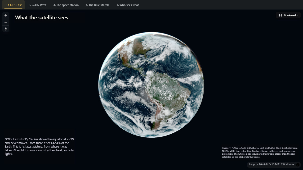
GOES-East sits 35,786 km above the equator at 75°W. At that height a satellite goes round the Earth exactly as fast as the Earth turns, so it never moves in the sky. From there it can see 42% of the planet, and it photographs all of it every ten minutes.
The first bookmark puts the camera over the same spot and shows the picture GOES-East took a few minutes before you opened the map. Open it at night in the Americas and it will be dark: the satellite switches to showing clouds by their heat, with city lights underneath.
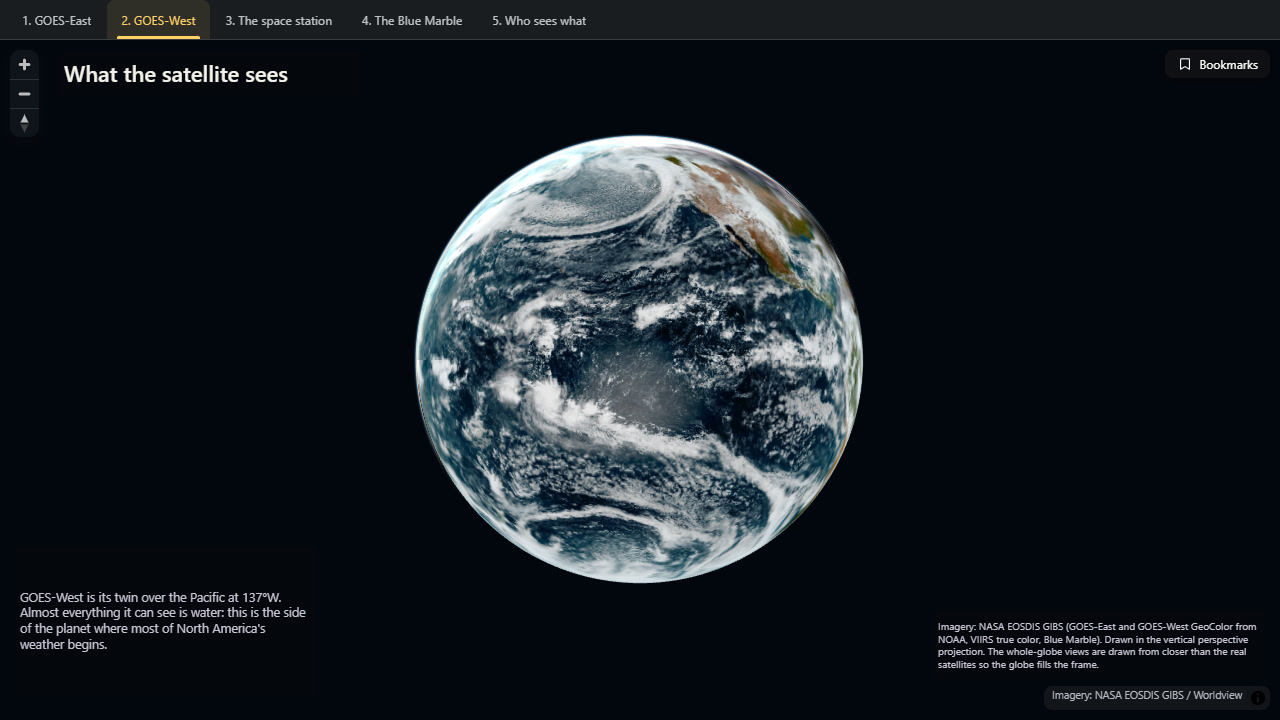
GOES-West is its twin, over the Pacific at 137°W. Almost everything it can see is water.
The space station
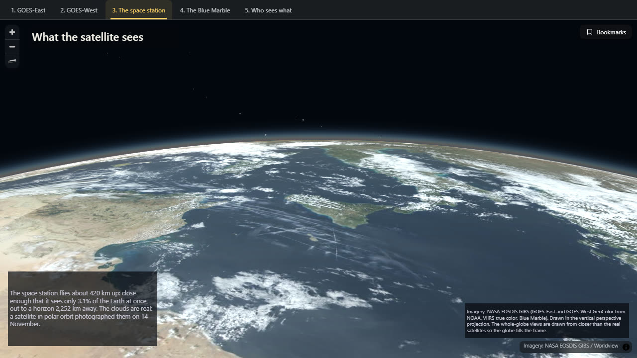
The space station flies about 420 km up. That is so much closer that it sees only 3% of the Earth at once, out to a horizon about 2,250 km away. This view looks north-west from over Libya, across Sicily and Italy. The clouds are real: a satellite in polar orbit photographed them on 14 November.
It's the same projection as the weather satellite's view. Only the height has changed.
The Blue Marble
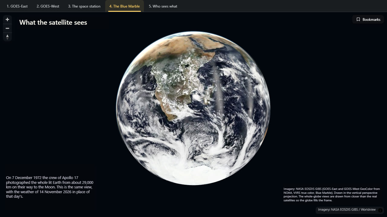
On 7 December 1972 the crew of Apollo 17, on their way to the Moon, photographed the whole lit Earth from about 29,000 km. It became one of the most reproduced photographs ever taken. The fourth bookmark is that view, with the weather of 14 November 2026 in place of that day's.
Who sees what
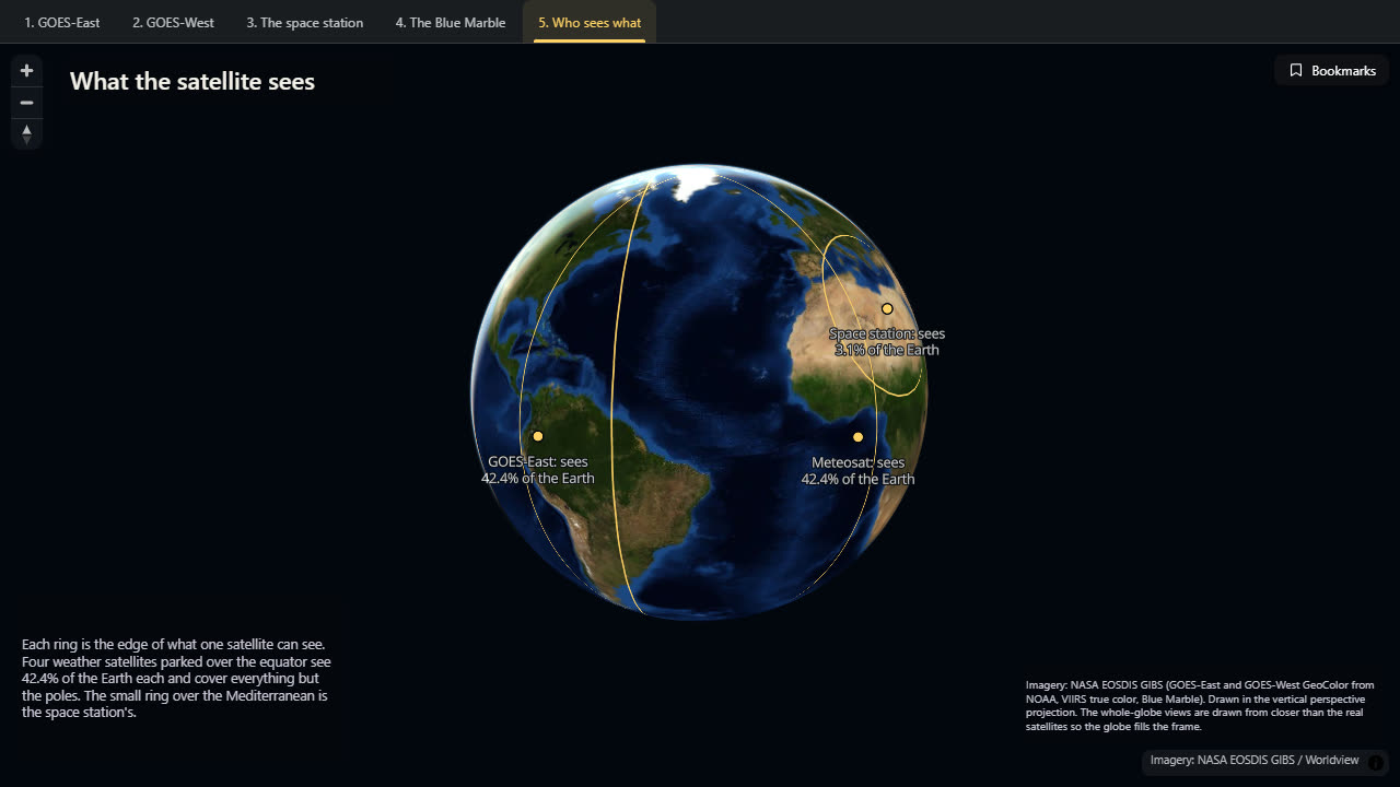
The last view draws the edge of each satellite's view on the ground. Four weather satellites parked over the equator (GOES-East, GOES-West, Europe's Meteosat and Japan's Himawari) each see 42% of the Earth, and between them they cover everything but the poles. The small ring is the space station's.
How did I build it?
There is no data in this map apart from pictures, and the interesting thing is the journey the pictures make.
A weather satellite's picture starts out in the vertical perspective projection, because that is simply what a camera in space produces. NASA then flattens it into ordinary web map tiles, in the Mercator projection, so that it can be laid on any web map. Icon Map for Fabric takes those tiles as raster layers and, with the map's projection set to vertical perspective, projects them back again. Put the camera where the satellite was and you get the satellite's picture back.
The imagery is from NASA's Global Imagery Browse Services: the GOES-East and GOES-West "GeoColor" pictures, which the map always asks for the latest of, a daily true-color mosaic from a satellite in polar orbit for the station and Blue Marble views, and NASA's cloud-free Blue Marble underneath for anywhere a satellite can't see.
The rings in the last view are simple geometry: the edge of what you can see from a height is a circle on the ground, and its size depends only on how high you are. They're two small files in a Fabric lakehouse.
How accurate is it?
The whole-globe views are drawn from closer than the real satellites. The map's camera has a fixed field of view, and at a weather satellite's true distance the Earth would only fill about half the frame. So I've brought the camera in, to around 26,000 km in the embedded map above. That costs a sliver of the edge of the disc: you see a little less than the satellite does. The camera's height also changes with the size of the window, so treat all the heights as "about".
The Blue Marble's distance is itself uncertain. About 29,000 km is the figure usually quoted, but sources differ, and I've placed the camera by eye from the photograph.
The space station view is a place the station does pass over, at about the right height, but it isn't where the station is now.
The satellite positions are their published stations over the equator. The 42% and 3% figures are the share of a perfectly round Earth inside each one's horizon; the useful part of a satellite's picture is smaller, because the edge of the disc is seen at a very shallow angle.
Sources
Imagery: NASA EOSDIS Global Imagery Browse Services (GIBS): GOES-East and GOES-West GeoColor (NOAA), VIIRS corrected reflectance true color (NOAA-20), and Blue Marble shaded relief and bathymetry.