

A map can contain a great deal of useful data and still be difficult to use.
That becomes clear when building an electricity-network demonstration in Power BI. The report combines multiple fictitious incidents with province boundaries and several detailed reference datasets representing power lines, poles, towers and other infrastructure.
Each dataset makes sense on its own. Put everything on screen at the same time, however, and the result quickly becomes difficult to interpret.
The lesson is not simply that there is too much data. It is that too much detail is being shown too soon.
A useful map needs an information hierarchy. At national scale, the reader needs orientation and broad patterns. As they move closer, the map can progressively introduce network structure, infrastructure and individual assets.
There is also an important technical distinction behind that approach: hiding a layer at a particular zoom level does not necessarily mean its data is never supplied to the visual.
Those are two different problems, and good Power BI map design needs to address both.
Start with the worst case
The reference data used for the demonstration contains more than 450,000 geographic features:
- Poles and towers: 389,116 points
- Power-network lines: 48,368 linestrings
- Infrastructure: 12,737 linestrings and 721 polygons
- Province boundaries: 4 multipolygons
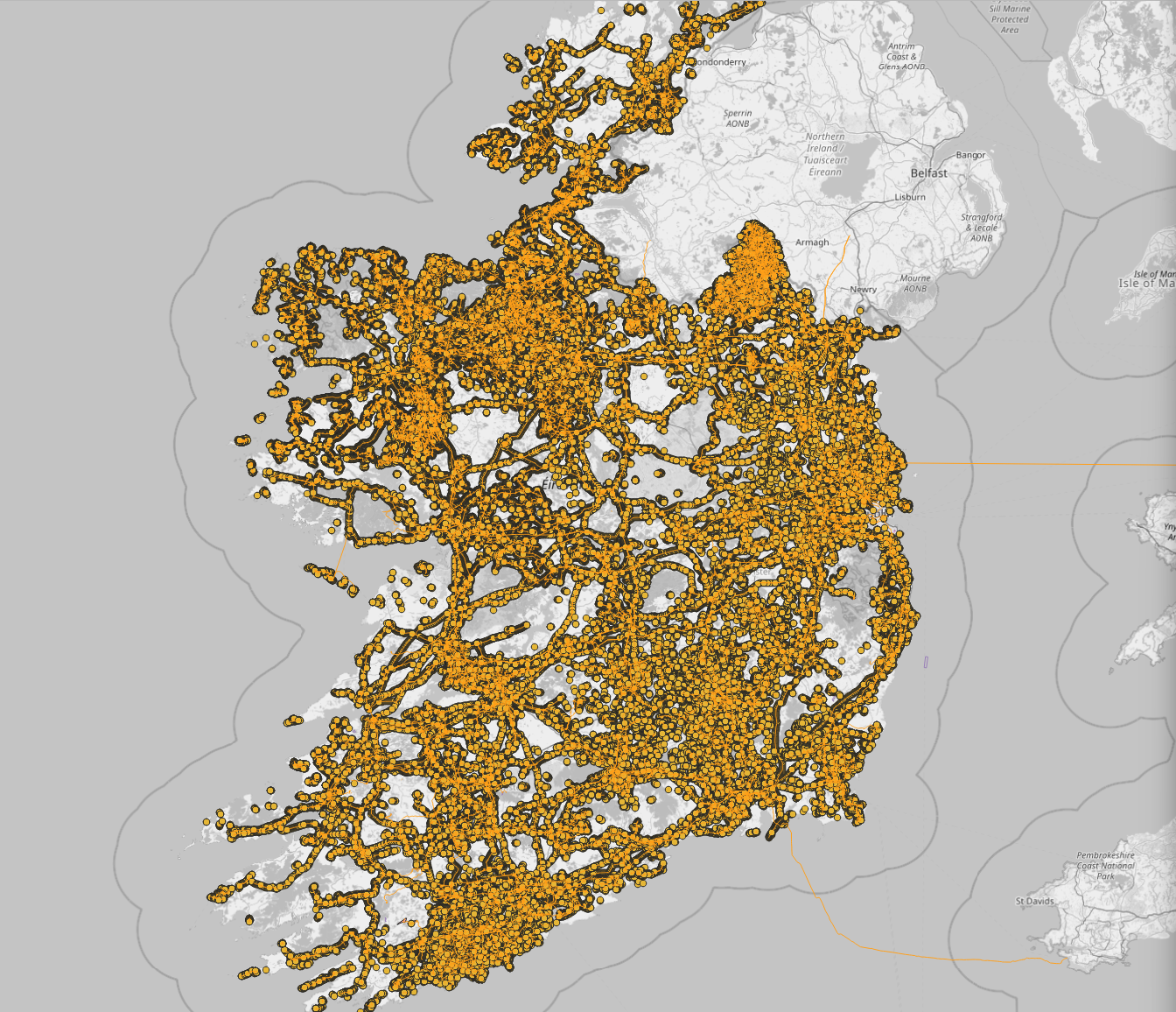
With all layers being shown simultaneously, individual assets merge into dense corridors. Lines compete with one another and with the basemap. Large numbers of points become continuous bands rather than distinguishable objects.
The data itself is valid. The problem is the relationship between data density, screen space and geographic scale.
A pole might be important when inspecting a street or individual circuit. At the scale of an entire country, displaying nearly 390,000 of them gives the reader very little additional information.
Completeness is not the same thing as clarity.
Begin with the question the map needs to answer
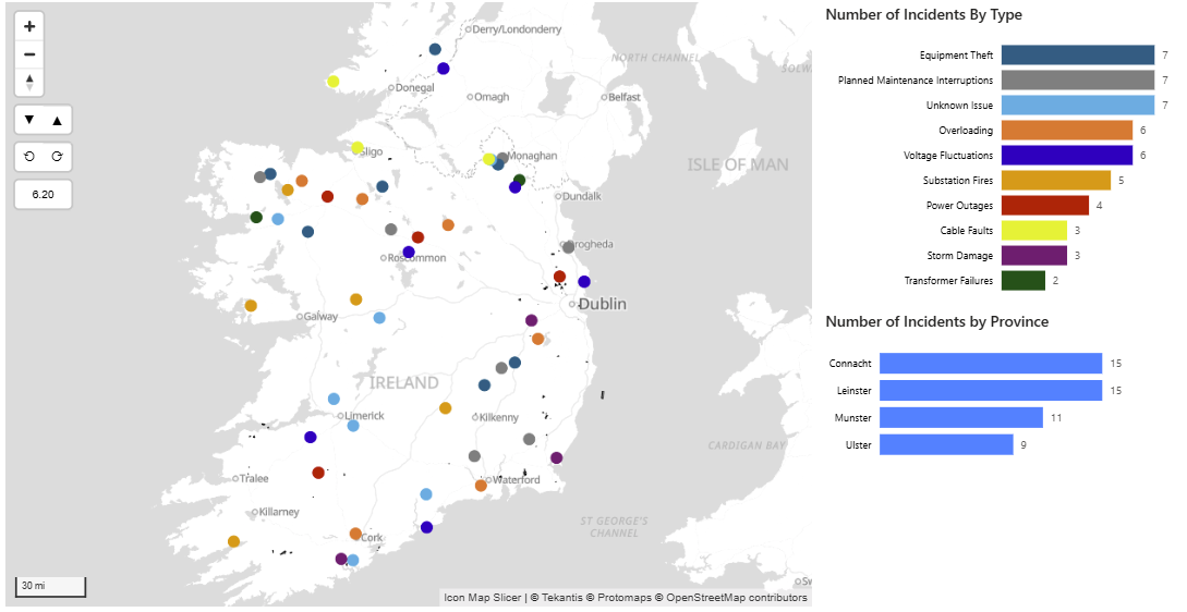
Where are the incidents located across the country?
It shows 50 fictitious incidents across Ireland, as circles with colour identifying incident type. Charts alongside the map summarise those incidents by type and province.
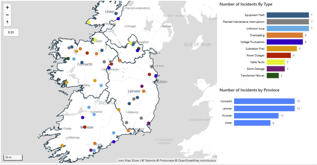
At this scale, the report has an obvious purpose: show where incidents are occurring and give the reader a sense of their geographic distribution.
This provides a useful starting principle for Power BI mapping:
Decide what question a map should answer at its current scale before deciding which data to display.
Think in geographic scales
A single Power BI report can support questions ranging from national monitoring to individual asset investigation.
It does not follow that every layer should be visible while answering all of those questions.
A more useful hierarchy might look like this:
- National ( Incidents, province or operational boundaries ): Where are the broad patterns?
- Regional ( Major circuits and substations ): Which part of the network is involved?
- Local ( Detailed network and infrastructure sites ): How does the local network connect?
- Street or asset ( Poles, towers, equipment and labels ): Which exact asset needs attention?
These are not universal thresholds.
A sparse rural network might tolerate detailed information sooner than a dense urban network. A large report canvas may provide more room than a small embedded visual. Viewing a map on a computer can provide more detail compared to a mobile device.
The important test is not whether Power BI can draw a feature at a particular zoom level. It is whether the feature is useful and legible there.
What happens when layers appear too early?
Testing the reference datasets individually at approximately zoom level 6 makes the effect easy to see.
Power-network lines
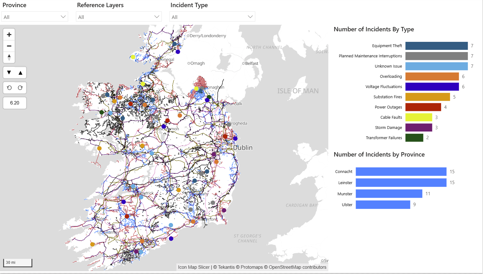
The network is visible, but national-scale linework already creates considerable visual competition. The power-network lines show the broad structure of the system, but they quickly form a busy mesh.
At a regional scale, those same lines can help the reader understand how an incident relates to a circuit or corridor. At national scale, much of that detail competes for attention without helping answer the main question.
Poles and towers
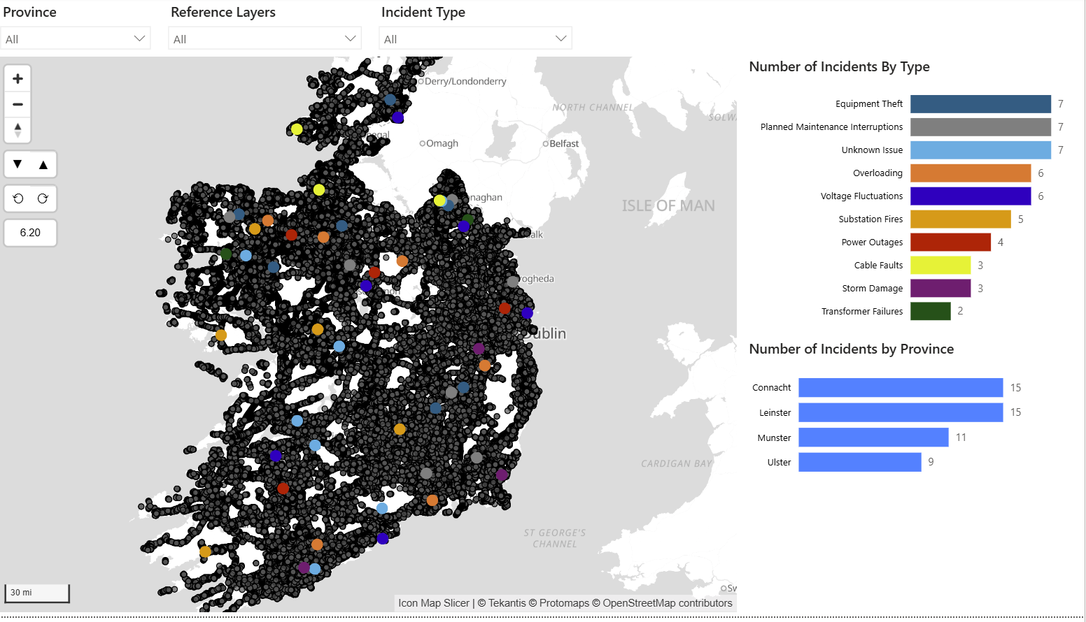
Nearly 390,000 pole and tower points overwhelm the national view. The poles layer demonstrates the problem much more dramatically. Almost 390,000 individual points overlap into dense bands across the country. Individual assets cannot be distinguished, while the layer obscures both the basemap and much of the network beneath it.
Nothing is wrong with those points. They are simply being displayed at a scale where the reader cannot make meaningful use of them.
Infrastructure - polygons and linear
Both linear and polygon Infrastructure are present, but most are too small to interpret at national scale. The infrastructure objects are much less dense, but they suffer from a different problem. At national scale, many of the features occupy only a handful of pixels. The geometry technically exists on screen, but its shape and meaning cannot be understood.
Taken together, these tests show why the number of records alone is not a sufficient guide to map design.
The question is how much simultaneous visual information the reader can actually use.
Why Icon Map layers matter?
The advantage of treating these datasets as separate Icon Map layers is that styling, visibility and zoom behaviour can be controlled independently, while the report still behaves as one coherent map.
How the Icon Map implementation works
The Icon Map implementation separates the geography into multiple logical map layers rather than trying to render the entire dataset as one undifferentiated view.
The incident locations remain the principal analytical layer. Reference information such as province boundaries, network lines, infrastructure sites and poles is then introduced through separate layers, each with its own styling and zoom behaviour.
Conceptually, the implementation looks like this:
| Layer | Purpose | Styling | Zoom visibility |
|---|---|---|---|
| Incidents | Principal analytical layer | Coloured by incident type and rendered as circles | Visible at all zoom levels |
| Province boundaries | National orientation and geographic context | No polygon fill, with a strong outline | Zoom levels 4 to 10 |
| Major network lines | Show regional network structure and connectivity | Line styling appropriate to the network | Zoom level 8 onwards |
| Infrastructure sites and local features | Provide local operational context | Polygon and line styling | Zoom level 10 onwards |
| Poles, towers and detailed assets | Support asset-level investigation | Individual point symbols | Zoom level 12 onwards |
The purpose of this structure is not simply to hide information. It is to give each layer a clear role.
Incidents remain visually dominant because they are the subject of the report. Province boundaries provide geographic context. Network lines explain connectivity. Asset-level information appears only when there is enough map space for the reader to interpret it.
Icon Map Pro and Icon Map Slicer support minimum and maximum zoom settings on map layers. These settings allow the visual to decide when a layer should be drawn as the user moves between national, regional and local views.
The right threshold depends on the density of the underlying geography, the size of the map visual and what the report user is trying to accomplish.
The key principle is that the zoom threshold should correspond to the point at which a layer becomes useful, not merely the point at which it can technically be displayed.
Reveal complexity progressively
Once the national view establishes orientation, more detailed information can appear as the reader zooms towards the network.
At a regional scale, major circuits begin to explain how incidents relate to network structure.
At a local scale, infrastructure polygons and selected linear features provide additional operational context.
Closer still, individual poles and towers become distinguishable and therefore useful.
This is progressive disclosure applied to mapping.
Instead of asking the reader to interpret hundreds of thousands of geographic objects immediately, the report earns its complexity as the reader moves from overview to investigation.
Filtering and zoom have different jobs
The filter answers which data matters?
A province, operational area, asset class or time-period filter determines which part of the dataset is relevant to the analysis.
The zoom level answers how should that data be presented at this scale?
It determines which level of geographic detail is appropriate for the current view.
Used together, they create a natural investigation sequence:
- Select the relevant area or category.
- Focus the map on that geography.
- Reveal major circuits and substations as regional context becomes useful.
- Zoom further to introduce detailed infrastructure.
- Show individual poles, towers, equipment or labels only when they can be interpreted.
Zoom visibility is not the same as data reduction
This distinction becomes particularly important when considering performance.
For any data layers, the data query sent to the visual includes all records when the visual is loaded. A minimum or maximum zoom rule is applied in Icon Map when deciding whether a layer should be drawn. In other words, the decision to show or hide a layer happens after the visual receives the data.
Uploaded geographic files used as reference layers follow a different route from data-bound fields, but the same caution applies. A file uploaded to a report will still need to be loaded and prepared even when its map layer is hidden at the current zoom level.
Zoom rules can help with
- Visual clutter
- Which layer is drawn at each scale
- Progressive disclosure
Zoom rules do not reduce
- Rows returned by the Power BI query
- The size of an uploaded GeoJSON resource
- Memory required to hold or render a layer
A visually simple map is therefore not necessarily a computationally lightweight map.
Manage workload separately
If a report becomes slow or unstable, zoom-dependent visibility should be combined with techniques that reduce the data or geometry the visual needs to handle.
Several approaches are particularly relevant.
- Filter before data reaches the visual: If the user only needs one operational area, network or asset class at a time, apply that restriction as early as practical
- Separate overview from detail: A national map may only need aggregated or simplified information. Asset-level data can appear on a drill-through page or dedicated detailed map
- Simplify geometry: Detailed lines and polygons may contain far more vertices than are useful at the intended display scale
- Separate major and minor network features: The national view may need primary circuits while local analysis needs the complete network
- Aggregate dense point layers: If individual poles cannot be interpreted nationally, there is little value in presenting each pole as an independent mark at that scale
- Consider tiled reference data for very large datasets: Instead of treating a countrywide reference dataset as one large resource, a tiled architecture can retrieve geographically relevant information as the map moves
These techniques solve a different problem from minimum and maximum zoom settings.
Zoom rules manage the presentation of complexity.
Filtering, aggregation, simplification and appropriate data delivery manage the workload behind that presentation.
The broader lesson
A map does not become more useful simply because it displays more data.
With more than 450,000 geographic features available in this example, the challenge is not finding enough information to show. It is deciding when each piece of information becomes meaningful.
Scale-aware design gives every layer a role.
Province boundaries orient the reader. Major circuits explain regional structure. Detailed infrastructure supports local investigation. Individual assets appear when the reader is close enough to distinguish and use them.
At the same time, report authors need to remember that hiding those layers does not automatically remove their data-processing cost.
The strongest Power BI maps therefore combine two ideas:
Reveal geographic detail progressively, and manage data volume deliberately.
Icon Map Pro and Icon Map Slicer support multi-layer Power BI mapping and scale-dependent visibility, making it possible to build experiences that move from a national overview towards detailed asset investigation without forcing every layer onto the screen at once.
The result is not a map with less information - it is a map that presents information at the point where the reader can actually use it.