
Insurance has always been a location business.
A property policy is not just attached to a person or organization. It is attached to a building, a street, a neighborhood, a floodplain, a wildfire corridor, a repair network, a local economy and a regulatory environment. Health, life, commercial, motor and catastrophe lines all have their own geography too. The challenge is that much of this spatial context sits outside the systems insurers use every day.
That is where the Icon Map Catalog can become valuable. Rather than treating geospatial data as a separate GIS exercise, insurers can bring ready-to-use US location datasets directly into Power BI, combine them with internal policy and claims data, then explore the results through Icon Map Pro and Icon Map Slicer.
The result is not just a better-looking map. It is a practical way to ask better insurance questions.
From map layers to underwriting context
Most insurers already have rich internal data. Policy records, claims histories, risk scores, sums insured, customer segments, broker territories, repair partners, inspection outcomes and loss ratios all contain location clues.
The problem is that those records often lack external context.
A policy address may tell you where a property is, but not whether that neighborhood has elevated flood risk, high housing cost pressure, poor transport resilience, concentrated vulnerability, limited healthcare access or changing demographics.
The Icon Map Catalog helps fill that gap with ready-to-use US layers. For example, catalog layers based on FEMA risk data can provide composite risk, expected annual loss, social vulnerability and community resilience. Hazard-specific layers can also help teams review flood, wildfire, drought, heat, severe wind, hurricanes, tornadoes, winter weather and earthquake-related hazards.
That means an insurer can take internal exposure data by address, ZIP code, census tract or county, and add external risk context without building every spatial layer from scratch.
Property insurance: moving beyond a single hazard view
A property insurance team might start with a simple question:
Where do we have high insured value in areas with elevated natural hazard risk?
With Icon Map Pro, an analyst could create a multi-layer Power BI report that combines:
- Policy count and total insured value by census tract
- Claims frequency and severity by peril
- Composite natural hazard risk
- Flood, wildfire, heat, wind and winter hazard layers
- Building or housing density
- Local socioeconomic vulnerability indicators
Icon Map Pro is particularly useful here because it supports multiple simultaneous layers. A report could show high-value policy concentrations as proportional circles, natural hazard risk as a choropleth, and claim hotspots using H3 hexagons. The same page could then use 3D extrusion to highlight areas where exposure is greatest, or switch between hazard layers to compare flood, wildfire and severe wind scenarios.
The value comes from combining the organization’s own view of exposure with neutral, external geography. A county with moderate hazard risk may become high priority if the insurer has unusually high sums insured there. A tract with high expected annual loss may be less material if exposure is low. The map becomes a portfolio triage tool rather than a static reference layer.
Flood, wildfire and heat: seeing risk at the right scale
National maps are useful for context, but insurance decisions often need local detail.
Flood, wildfire and heat risk do not follow neat administrative boundaries. They vary across catchments, coastlines, urban form, vegetation, elevation, construction pattern and local resilience. Even when analysis is aggregated to a county or census tract, the ability to view risk spatially makes the pattern easier to understand.
This opens up practical insurance analysis such as:
- Comparing flood claim history against flood risk scores
- Identifying high-exposure tracts where flood claims have not yet emerged
- Mapping wildfire exposure alongside policy growth
- Finding regions where heat risk intersects with vulnerable populations
- Reviewing pricing or underwriting appetite by hazard type
These are exactly the kinds of questions that are difficult to answer from tabular reports alone. A table can rank counties by expected annual loss, but a map shows the spatial pattern, neighboring exposure, regional concentration and operational implications.
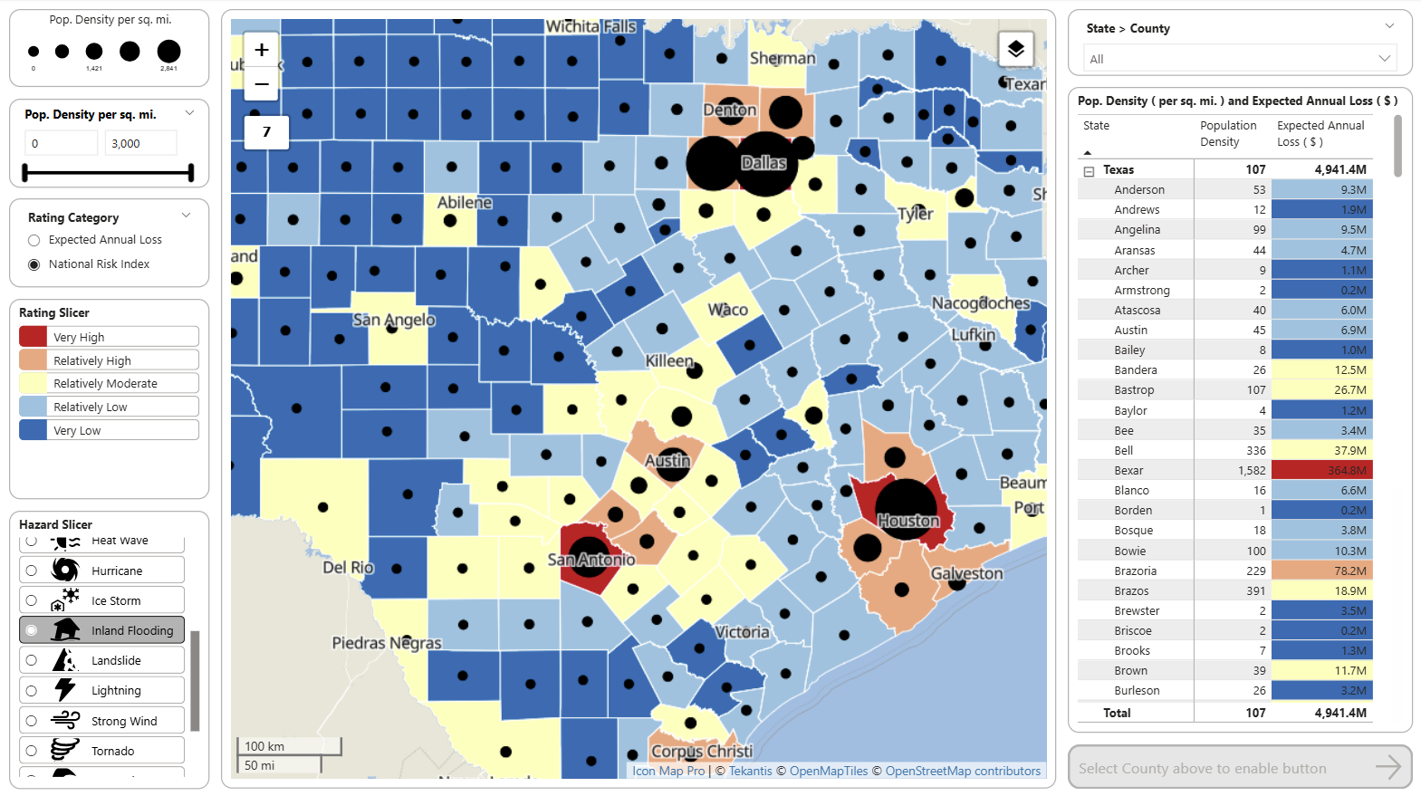
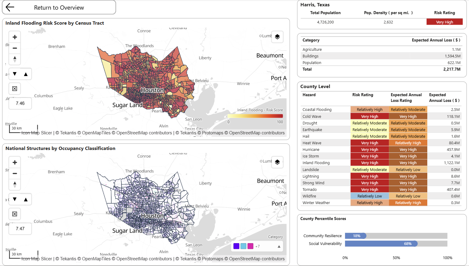
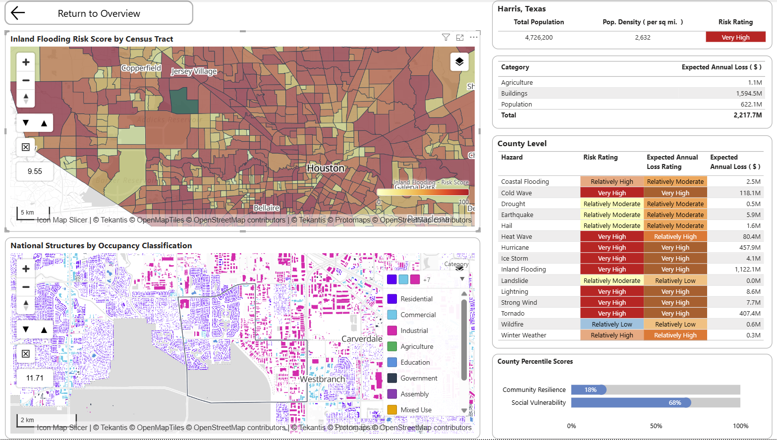
The three screenshots below show a natural analytical workflow. The report starts with a county-level overview, where users can compare National Risk Index ratings, population density and expected annual loss across Texas. From there, the user drills into Harris County to see how inland flooding risk varies by census tract. Finally, the report zooms further into the local area and combines tract-level flood risk with structure-level occupancy data.
This progression is important for insurance analysis because risk is not evenly distributed within administrative boundaries. A county may have a very high overall risk rating, but the operational question is where that risk sits, what types of structures are exposed, and whether the pattern has implications for pricing, underwriting, claims planning or portfolio management.
A table can identify Harris County as a high-loss area, but the maps explain why and where. They show the spatial pattern of risk, the neighboring exposure, and the relationship between hazard intensity and the built environment.
Housing affordability and mortgage exposure
Insurance is not only about hazard. Housing market pressure also matters.
For property insurers, mortgage insurers, lenders, reinsurers and public-sector insurance schemes, local affordability can influence claims behavior, resilience, underinsurance, repair affordability, vacancy risk and customer vulnerability.
The Icon Map Catalog can support this kind of analysis through housing affordability, housing condition, subsidy, FHA mortgage and location affordability datasets. These can help insurers understand where housing stress, mortgage exposure and property risk intersect.
For insurers, this becomes powerful when joined to internal data:
- Claims settlement delays by housing cost burden
- Cancellation or lapse rates by affordability pressure
- Underinsurance risk in high-cost or high-vulnerability communities
- Repair network performance in areas with housing stress
- Mortgage insurance exposure in tracts with high FHA activity
For mortgage and property insurers, this could support a more joined-up view of homeownership exposure, affordability, property concentration and local risk.
Health, vulnerability and life insurance insight
For health and life insurers, location intelligence is not just about natural hazards. It is about population health, access, vulnerability and socioeconomic context.
Health outcome layers, health insurance coverage, demographic indicators and social vulnerability measures can all add useful context to customer and claims data. Combined with internal data, these layers can support analysis such as:
- Identifying regions with high chronic disease prevalence and low product penetration
- Understanding health claims patterns in relation to local social determinants
- Mapping uninsured populations against outreach or distribution networks
- Comparing customer acquisition against local health need
- Supporting broker or provider network planning
Icon Map Slicer can add another useful dimension here. Because it acts as a spatial slicer, users can draw or click on an area of the map and filter the rest of the Power BI report. A user could select a group of census tracts with high health need, for example, and instantly see policy count, claims cost, customer demographics, sales performance and provider availability for that selected geography.
That is a different experience from simply viewing a map. The map becomes the filter, the entry point and the analytical workflow.
Environmental justice and regulatory context
Insurance organizations increasingly need to understand social and environmental context. This is relevant for product design, pricing oversight, regulatory reporting, customer outcomes, climate resilience and public-private partnerships.
Environmental and demographic layers can be combined with internal operational measures such as:
- Claim response times
- Inspection coverage
- Complaints
- Non-renewals
- Premium changes
- Broker and agency access
- Catastrophe response activity
For example, an insurer could review whether high-risk areas are also high-vulnerability areas, then assess whether claims operations and communications are appropriately designed for those communities. In Power BI, this can be explored alongside business metrics rather than isolated in a specialist GIS application.
Operational planning: claims, inspections and repair networks
Insurance location intelligence is not only for underwriting. It can also improve operations.
After a major weather event, claims teams need to know where exposure is concentrated, which customers may be affected, which suppliers are nearby and where vulnerable customers may need additional support. With Icon Map Pro, insurers can combine:
- Policy locations
- Open claims
- Adjuster territories
- Repair partner locations
- Weather or hazard footprints
- Natural hazard risk layers
- Vulnerability indicators
- Transport and infrastructure context
Icon Map Slicer can then allow operations teams to select an impacted area and filter live operational dashboards. A claims manager could draw around a storm-affected corridor and immediately see open claims, average claim age, supplier capacity, vulnerable customer counts and escalation status.
This is where the difference between a map and a spatial workflow matters. The user is not just looking at points on a map, they are using the map to drive decisions.
Why ready-to-use geographies matter
One of the hidden costs in insurance analytics is preparing spatial data.
Different datasets use different boundaries, scales and identifiers. Some are at county level, others at census tract, block group, ZIP code or parcel level. Some need to be simplified, tiled, styled or joined before they are usable in a report. For many BI teams, that work becomes a barrier.
The Icon Map Catalog reduces that friction by making layers available as ready-to-use map layers for Power BI. Many US datasets expose standard geographic identifiers such as GEOID, STATEFP, COUNTYFP, tract identifiers and ZIP/ZCTA codes, making them easier to join with internal data and other public datasets.
For an insurance analytics team, this means less time preparing map data and more time asking commercial questions.
What an insurer could build
A US insurer could use the Catalog to build several high-value Power BI applications.
Portfolio Risk report
Combine policy exposure, sums insured, loss ratio and claims severity with composite and hazard-specific risk layers. Use Icon Map Pro for multi-layer visualization and Icon Map Slicer to filter by selected areas.
Flood Exposure review
Map inland and coastal flood risk alongside property exposure, historic water claims, deductibles and renewal status. Highlight places where exposure growth is outpacing risk appetite.
Vulnerable Customer Response report
Join claims activity to health, demographic, social vulnerability and environmental indicators. Support operational prioritization during catastrophe response.
Housing and Mortgage Insurance insight
Combine housing affordability, location affordability and FHA mortgages, policy tenure, cancellation and claims data. Identify communities where affordability pressure and property risk intersect.
Agency and Broker Territory planning
Use census, employment, income, housing and risk layers to design territories, assess market potential and compare distribution performance across regions.
Reinsurance and Accumulation analysis
Create a national view of exposure concentration by county and tract, then overlay hazard scores, expected annual loss and recent claims. Use map-driven filtering or drillthrough to move quickly from national overview to local detail.
A practical route to value
The most effective starting point is not to map everything. It is to choose one business question and enrich it with the right location context.
For example:
Where are we most exposed to flood losses, and which of those communities may require additional operational support after an event?
A first report could combine:
- Internal policy exposure
- Flood claims history
- Flood hazard risk
- Composite natural hazard risk
- Social vulnerability indicators
- Environmental indicators
- Repair partner locations
- Claim handler territories
From there, the same model can be extended to wildfire, severe wind, heat or housing affordability.
That is the strength of working inside Power BI. Location intelligence becomes part of the existing reporting workflow. Business users can filter, drill, compare, export, collaborate and act using familiar tools, while Icon Map Pro and Icon Map Slicer add the spatial capability that standard visuals do not provide.
The bigger opportunity
For insurance, the Icon Map Catalog is not just a library of map layers. It is a way to enrich organizational data with geographic context at speed.
The real value comes from the combinations:
- Exposure plus hazard
- Claims plus vulnerability
- Affordability plus lapse risk
- Health outcomes plus product access
- Repair networks plus event impact
- Broker territories plus market potential
- Reinsurance accumulation plus expected annual loss
Insurers already have the internal data. The Catalog supplies the external geography. Icon Map Pro and Icon Map Slicer bring both together in Power BI, turning location from a background attribute into a practical decision-making lens.
For US insurers looking to modernize portfolio analysis, underwriting insight, claims response and market planning, that combination can be a powerful place to start.